Perception-aware Sampling for Scatterplot Visualizations
April 29, 2025
Abstract
Visualizing data is often central in data analytics workflows, but growing data sizes pose challenges due to computational and visual perception limitations. As a result, data analysts commonly down-sample their data and work with subsets. Deriving representative samples, however, remains a challenge. This paper focuses on scatterplots, a widely-used visualization type, and introduces a novel sampling objective—perception-awareness—aiming to improve sample efficacy by targeting how humans perceive a visualization.
We make the following contributions: (1) We propose perception-augmented databases and design PAwS: a novel perception-aware sampling method for scatterplots that leverages saliency maps—a computer vision tool for predicting areas of attention focus in visualizations—and models perception-awareness via saliency, density, and coverage objectives. (2) We design ApproPAwS: a fast, perception-aware method for approximate visualizations, which exploits the fact that small visual perturbations are often imperceptible to humans. (3) We introduce the concept of perceptual similarity as a metric for sample quality, and present a novel method that compares saliency maps to measure it. (4) Our extensive experimental evaluation shows that our methods consistently outperform prior art in producing samples with high perceptual similarity, while ApproPAwS achieves up to 100x speed-ups with minimal loss in visual fidelity. Our user study shows that PAwS is often preferred by humans, validating our quantitative findings.
1 Introduction↩︎
Data visualizations are a powerful tool commonly used by practitioners to understand, analyze, and find interesting patterns in their data. Scatterplots, in particular, are one of the most popular and frequently used visualization types [1]–[3]. Their efficiency and usability have been evaluated in various visualization tasks, such as those identified by Amar et al. [4]: from identifying outliers and clusters to correlation trends [5]–[9].
As the amount of data grows, however, data analysis and visualization become highly challenging [10], [11]. This is often due to limitations in human perception: visual clutter can affect visual perception and comprehensibility of data [12], [13]. Moreover, as data gets larger, rendering times increase [14]–[16]. Optimizing the design of a scatterplot by varying visual features (e.g., point size, opacity, or color) [6], [13] can address perception challenges, but does not improve rendering scalability [2].
As a result, data analysts commonly work with samples of the data: sampling simultaneously tackles perceptual and interactivity challenges [13], [17]–[19]. Unfortunately, deriving good samples is non-trivial. Sampling can introduce artificial data patterns and may fail to represent the underlying information in the data sufficiently. Prior work has identified random sampling as the method most accessible to data analysts in practice [2], [20]. While random sampling is simple, quick, and unbiased, it often fails to reveal underlying patterns in the data or represent corner cases (e.g., outliers).
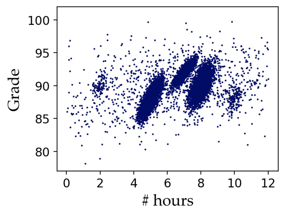
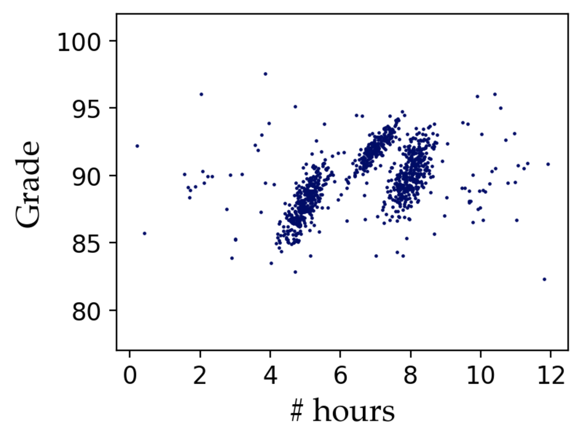
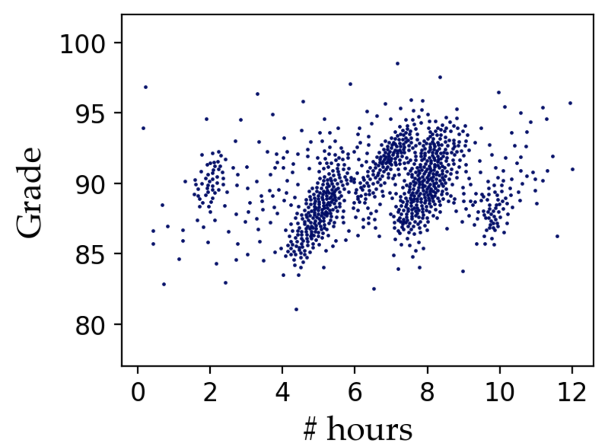
Figure 1: A random sample (b) of the original dataset (a) obscures the two smaller clusters. A sample of the same size, drawn with our perception-aware sampling method (c), better preserves key features of the original dataset, including trends, clusters, and outlier spread.. a — Original dataset, b — Random, c — Perception-aware
Example 1. Aysha, a data analyst, is exploring a dataset of historical student performance in three courses offered at a CS program. She uses a scatterplot to analyze the relationship between the time students spend studying per week and their course performance. Aysha draws a sample from the original dataset using uniform random sampling, and gets the visualization of Figure 1 (b). The visualization supports her expectation that more study time correlates with better grades. However, in this visualization, she fails to notice two separate cohorts of students that would have been clearly visible had she visualized the original data (Figure 1 (a)). The scatterplot of the original data depicts two additional smaller clusters—one indicates students who achieve good grades with little effort, likely due to prior exposure to the course material; the second indicates a small cohort of students who enrolled in the 4-credit section offered by one of the courses, corresponding to higher workload than their peers in the main 3-credit section. These smaller student cohorts are obscured in the sample Aysha is working with, causing her to miss important information and context in the data.
While working with samples is common in data analytics and visualization, as the example demonstrates, it may also lead to missed critical insights and distorted perceptions of the underlying trends in the data. With a distorted perception of the data, the user may fail at downstream tasks, such as feature selection or model design. The objective of this work is to design a data selection method that aims to optimize samples for human perception: given a desired sample size \(k\) and a target scatterplot visualization, we want to select \(k\) data points such that, when visualized in the target scatterplot, the sample best captures key focal aspects of the scatterplot of the original data. Figure 1 (c) depicts the sample that our perception-aware sampling method generates on the data of Example 1.
Why YASM (Yet Another Sampling Method)? There is an abundance of sampling techniques, and the relevant literature goes back many decades [11], [16]–[18], [21]–[28]. Frequently, sampling methods optimize for preserving data-driven properties like outliers, relative densities, spatial separation, or data shape [2], [6]. Each method is designed to handle specific use cases, and there is no one-size-fits-all solution. Importantly, even when certain data-driven or statistical properties are preserved in a sample, these properties may still appear distorted as perceived by human users through visualizations when sampling algorithms do not specifically consider human perception as an objective.
We revisit the setting of Example 1, and highlight the behavior of three sampling methods that commonly appear in the visualization literature. Figure 2 (a) visualizes the sample produced by density-biased sampling [22], which probabilistically over-samples sparser areas and under-samples denser areas; due to randomization, it may fail to properly represent outlier points despite their high probabilities, and as we see in this result, it behaves similarly to random sampling and also misses the smaller clusters. Parker et al.proposed visualization-aware sampling (VAS) [16] with similar goals to our work, to support efficient visualizations using small samples that maintain a good visual representation of a larger underlying dataset. VAS optimizes a visualization-aware loss function: the loss of not including a point in the sample is minimized if one of its close neighbors is in the sample. This leads to good overall shape and coverage, but it is very sensitive to noise, and, as we see in the result of Figure 2 (b), VAS produces a very poor sample on the data of Example 1. Finally, blue-noise sampling uses a radius \(r\) to select points that are at least \(r\) far apart from each other [29]. This method randomly selects a candidate point and rejects it if the radius condition is not satisfied. To guarantee the sample will reach the required size, the value of \(r\) is dynamically reduced. The adaptive nature of blue-noise sampling affords a more balanced representation between dense and sparse areas (Figure 2 (c)). However, this comes at the expense of a high computational cost: Quadri et al. [6] report running times up to two orders of magnitude worse than alternative approaches; Chen et al. [30] find the method takes up to 27 hours to produce a sample of size \(k\approx 6K\) out of \(1.56M\) points; in our analysis, blue-noise took \({\sim}3.6\) hours to generate a sample of size \(k=250\) out of \(3.5M\) data points when the slowest of competing methods needed \({\sim}5\) minutes.1
A recent study evaluating seven sampling methods by Yuan et al. [2], including blue-noise and density-based methods, suggests that existing algorithms excel at preserving only one or two dimensions of data patterns, such as regional density or outliers. There is a need for a sampling method to holistically account for human perception by preserving many key visual features and visually salient regions in a visualization, which will allow analysts to explore a wider range of data patterns with a sample.
Our work posits that sampling algorithms that account for a measure of human perception can produce more effective visualizations that are less likely to distort patterns and trends in the visualized data. Approaches like VAS [16] targeted similar goals, but the VAS objectives ultimately optimize for coverage rather than attempt to model human perception directly. Prior work used perceptual models in approximate query processing (AQP) for height estimation in bar charts [31] but existing literature lacks sampling algorithms that directly optimize for visual perception in scatterplots.
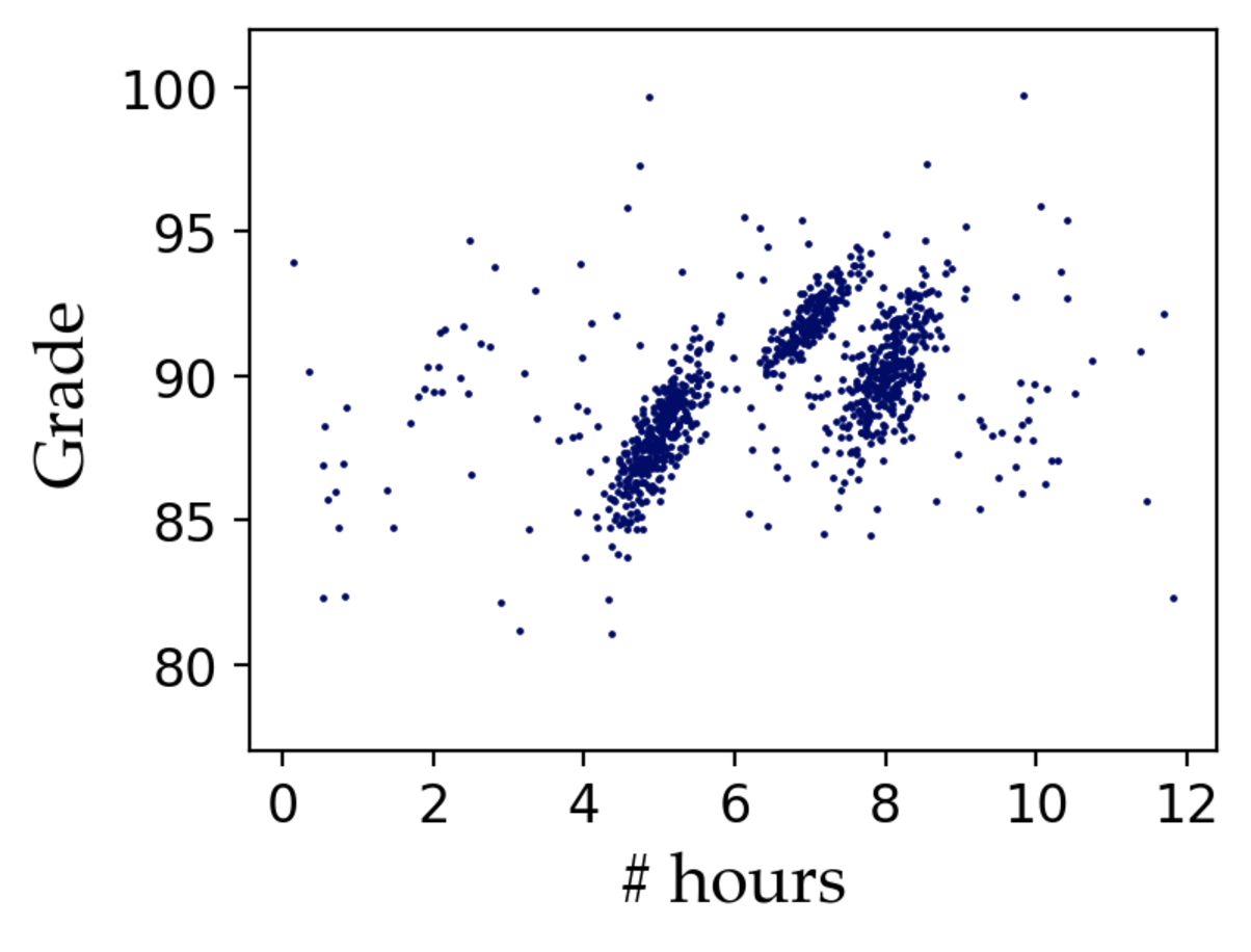
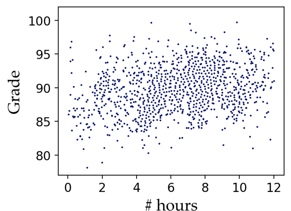
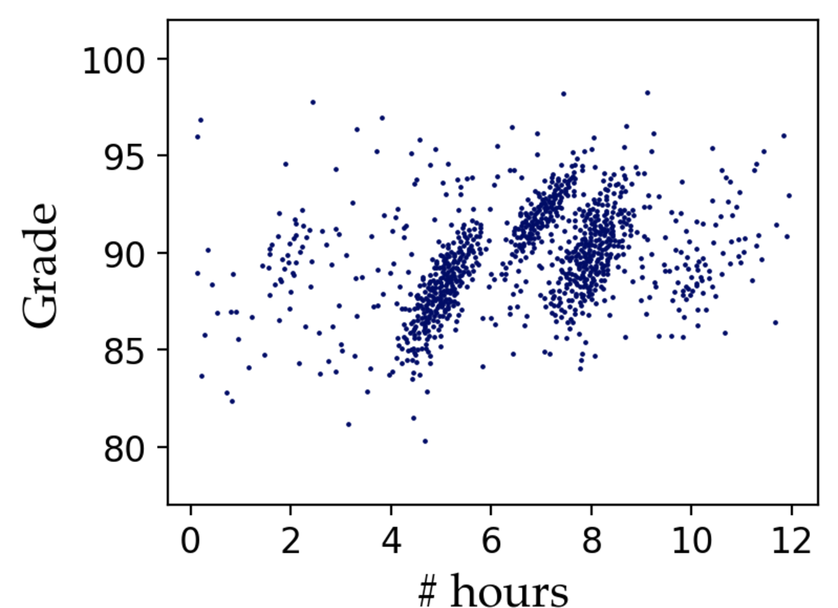
Figure 2: State-of-the-art sampling methods fail to preserve key aspects of the original dataset (Figure 1 (a)). The two smaller clusters in the data appear as noise in the density-biased and blue-noise samples, while VAS fails to capture any trends.. a — Density-biased, b — VAS, c — Blue-noise
In this paper, we present a novel sampling method—perception-aware sampling—that uses a model of human perception to derive samples that more effectively represent information in 2-dimensional scatterplot visualizations. Our work relies on four key insights:
Saliency maps can serve as a close proxy of perception. While prior work recognized the importance of “visualization-awareness” in sampling, existing objectives focused on coverage (represent as much of the shape of the underlying data as possible), rather than measures of how a human user would perceive the visualization [16]. We argue that we need not only visualization-awareness but also perception-awareness. Luckily, a tool that implicitly emulates human perception exists. We propose to employ established saliency models, commonly used in computer vision, that predict areas of a visualization that attract viewers’ attention [32]. These models produce saliency maps—essentially heatmaps—predicting eye-gaze locations in human interactions with a visualization [32]–[36]. We augment saliency with density information—a crucial element in how humans perceive a visualization [2]—to design a more robust perceptual model.
A good sample distorts saliency as little as possible. Intuitively, highly-salient areas are important in a visualization, as human focus is drawn to these areas. If the saliency of a sample differs from the saliency of the original data, this indicates that a human perceives this sample differently, as their focus is drawn towards different areas. Our key insight is that the saliency map of the sample should match the saliency map of the original data as much as possible. Intuitively, smaller difference between the two maps corresponds to smaller perceptual distortion in the sample.
To preserve saliency, we also need to account for coverage. The saliency of an area can be impacted by data in surrounding areas. For example, outliers in a visualization often draw attention and thus have high saliency; but a sample with only the outlier points will no longer demonstrate the same saliency (as these points would no longer be perceived as outliers). Therefore, to achieve high perceptual quality in the resulting sample, the sampling strategy needs to incorporate saliency with coverage to preserve the general data shape.
Limitations in human perception allow for visual approximations. In visual data exploration, analysts typically look for patterns, trends, and other insights, but they do not typically look at visualizations to read individual data points. Moreover, humans become less sensitive to small value perturbations in a complex visualization, which means that we can allow inaccuracies in the presented data, as long as the visualization preserves the overall trends [37]. We exploit these factors to produce a compressed representation of the data and generate approximate visualizations.
We provide an overview of our approach, including more discussion on these intuitions and design choices, in Section [sec:background].
Contributions and outline. To the best of our knowledge, our work is the first to explicitly model perception as an objective in sampling for scatterplot visualizations. In this paper:
We provide an overview of our sampling methodology, discuss important background literature, and formally define the problem of perception-aware sampling for scatterplots. [Section [sec:background]]
We propose perception-augmented databases and design PAwS, a hybrid method based on Max-Min diverse sampling that employs perception weights through a distance re-scaling mechanism. [Section 3]
We introduce ApproPAwS, a strategy that generates approximate visualizations, through a novel perception-aware compressed representation of the data. The key idea is to fragment the visual canvas into rectangular regions of similar perceptual significance, and we compress the data by adjusting the area size and data density each region encompassed. Then, we use a modified PAwS sampling that selects boxes to sample from and draws points uniformly at random within a box. [Section 4]
Measuring the quality of a sample is non-trivial, especially for the novel objective of perception-awareness. We contribute a detailed discussion on five metrics we use to evaluate the quality of the sampling algorithms, including an established image similarity metric that measures the difference between two visualizations in the saliency dimension. We discuss additional metrics and their implications. [Section 5]
We present an extensive evaluation of our methods against five state-of-the-art sampling algorithms, over six datasets with diverse underlying trends and sizes. We demonstrate that our sampling strategies have robust performance over the five metrics, and consistently outperform the alternatives. We observe that PAwS has emphasized benefits at smaller sampling rates, and scales better than the state-of-the-art. Further, we show that ApproPAwS achieves high-quality approximate visualizations at various levels of compression, with results comparable to PAwS, but up to 100x faster for large datasets. A user study further supports our findings and confirms PAwS samples are frequently preferred by humans. [Section 6]
2 Overview and Background↩︎
In this section, we present an overview of our approach, along with intuitions and necessary background. We start by describing our insights on modeling perception, and how to measure the perceptual quality of a sample. We proceed to formally define the problem of perception-aware sampling. We then discuss the intuitions driving the design of our perception-aware sampling algorithm. We pursue further speed-ups through approximate visualizations based on a perception-aware compression strategy.
2.1 Modeling perception through saliency↩︎
Efforts in human perception research have leveraged eye-tracking technologies to model how people perceive images in fields such as computer vision [38], [39] and natural language processing [40], [41]. Such technologies, however, are complex, not as readily available, and hard to incorporate into a sampling workflow.
We propose a new perceptual model based on saliency models, commonly used in computer vision, that predict areas of a visualization that attract viewers’ attention [32]. Saliency models take as input a visualization, and produce saliency maps—essentially heatmaps—predicting eye-gaze locations in human interactions with a visualization [32]–[36]. Various computer vision tasks have successfully leveraged saliency models: from automatically learning how to zoom in image classification tasks to designing data augmentation techniques for deep learning models [42], [43]. In this paper, we use saliency (augmented with density information) to direct sampling, so that the resulting sample preserves the attention points that saliency maps identify on the original data.
Saliency. Given a saliency model \(\mathcal{M}\) and a target visualization \(V\) of \(m \times n\) pixels, a saliency map \(\mathcal{M}(V): V^{m \times n}\) \(\rightarrow \;[0, 1]^{m \times n}\) is defined as a mapping function from the pixel space to continuous values within the \([0, 1]\) range, i.e., higher values indicate more salient pixels. In our implementation, we use an established, state-of-the-art saliency model for visualizations: Data Visualization Saliency (DVS) [32], [35]. Other saliency or perceptual models can be considered in alternative implementations, as this is a blackbox component in our framework. Figure 4b shows the saliency map produced by the DVS model over the data in Figure 4a.

![Figure 4: The DVS model [32], [35] derives a saliency map (b) of a scatterplot visualization (a). Human attention typically does not focus on the interior of dense areas, so the center of the map has low saliency. This heatmap can be projected on the data to assign saliency weights (c). Perception weights (d) augment saliency with density to indicate high perceptual significance for areas that are highly salient or highly dense.](/article/2504.20369/images/densityAug.png "fig:")
Accounting for high-density areas. Saliency models are designed to represent human attention, which is an intuitive proxy for perception, with one caveat: human focus is drawn on the perimeter of highly-dense elements, ignoring their interior. As a result, the saliency of a solid object is hardly indistinguishable from that of a hollow object (Figure 3); yet, most would agree that these shapes are perceived differently. Thus, we augment saliency models with density information, implementing the following intuition: an area of high saliency or high density should have a high perceptual value. Figure 4d shows the heatmap of perception weights computed over the data of Figure 4a; these combine the saliency weights (Figure 4c) with density information. We discuss the details in Section 3.
Measuring quality. There are no established measures for evaluating the quality of a sample, and in our case quality is based on a novel objective: perception-awareness. Intuitively, a good sample should draw human attention to the same salient areas as if the person was viewing the original dataset. Thus, the saliency map of the sample, should closely resemble the saliency map of the original data. We use Structural Similarity Index Measure (SSIM) [44], a well-established metric for comparing images, as our primary measure: given the saliency map of the visualization of a sample and the saliency map over the original data, the SSIM score should be high.
We are now ready to formalize our problem definition.
Definition 1 (Perception-Aware Sampling). Given a dataset \(\mathcal{D}\), a target visualization \(V\), a saliency model \(\mathcal{M}\), an integer \(k< |\mathcal{D}|\), and an image-based perceptual similarity function \(f\) we want to find \(\mathcal{D'}\subset \mathcal{D}\), such that \(|\mathcal{D'}|=k\) and \(f (\mathcal{M}(V_\mathcal{D}), \mathcal{M}(V_{\mathcal{D'}}))\) is maximized, where \(V_\mathcal{D}\) and \(V_{\mathcal{D'}}\) are the visualizations of \(\mathcal{D}\) and \(\mathcal{D'}\), respectively, over the target visualization.
2.2 Perception-aware sampling algorithm↩︎
Definition 1 seeks the sample of size \(k\) that results in the most similar saliency map as that of the original data. However, since the saliency model and the SSIM measure (which is our perceptual similarity function) are blackbox components, the objective cannot be optimized directly. Iterative approaches may be possible, but the computational cost of the saliency model makes repeated calls to it impractical. Thus, we explore heuristic methods.
The naive approach of using perception weights as sampling probabilities performs poorly (Figure 5 (b)). Intuitively, the reason is that the saliency of an area can be impacted by data in surrounding areas. For example, outliers may draw human attention, but if the sample only contained outlier points, they would no longer be perceived as outliers and the attention patterns could change. Based on this intuition, perception weights should be used in unison with coverage objectives to reduce perceptual distortion in the sample.
Max-Min diversification. Diversity and coverage are related objectives in data selection, and are well-studied by prior work [45]–[49]. Prior work has introduced a variety of diversification models; we focus on Max-Min, which is one of the most well-established and frequently-used models [45].
Max-Min diversification, also known as farthest point sampling in the visualization and computer vision communities [6], [50], [51], selects points that are uniformly dispersed across the data space, and thus provides coverage and preserves the original data shape [46], [52], [53]. The objective of Max-Min is to maximize the diversity of a sample, defined as the minimum pairwise distance of sample points. As with other coverage-based objectives, Max-Min is susceptible to noise (Figure 5 (c)), but it is computationally more efficient than VAS.
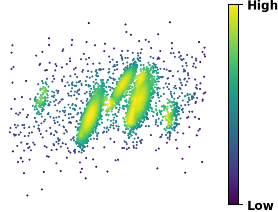
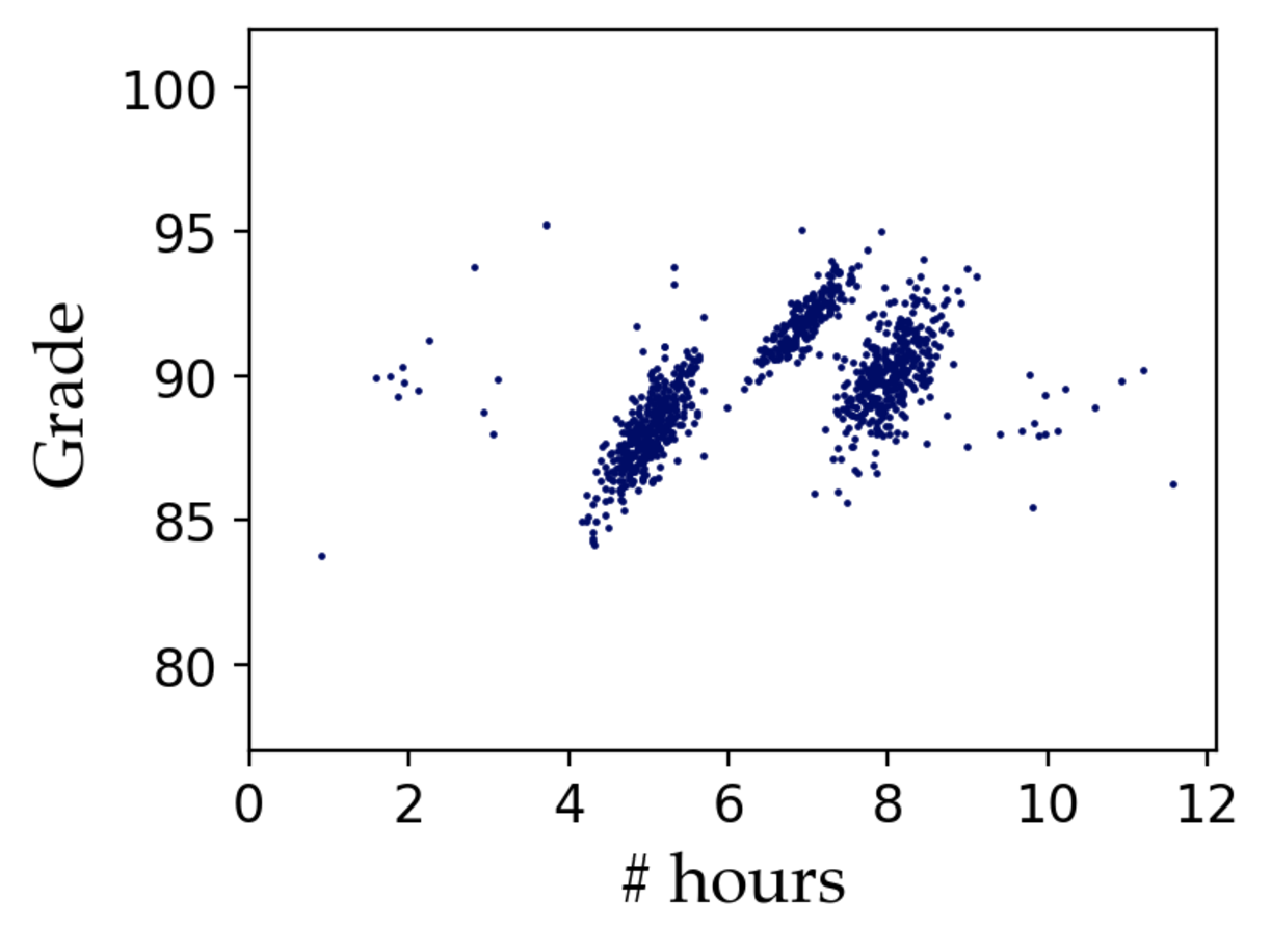
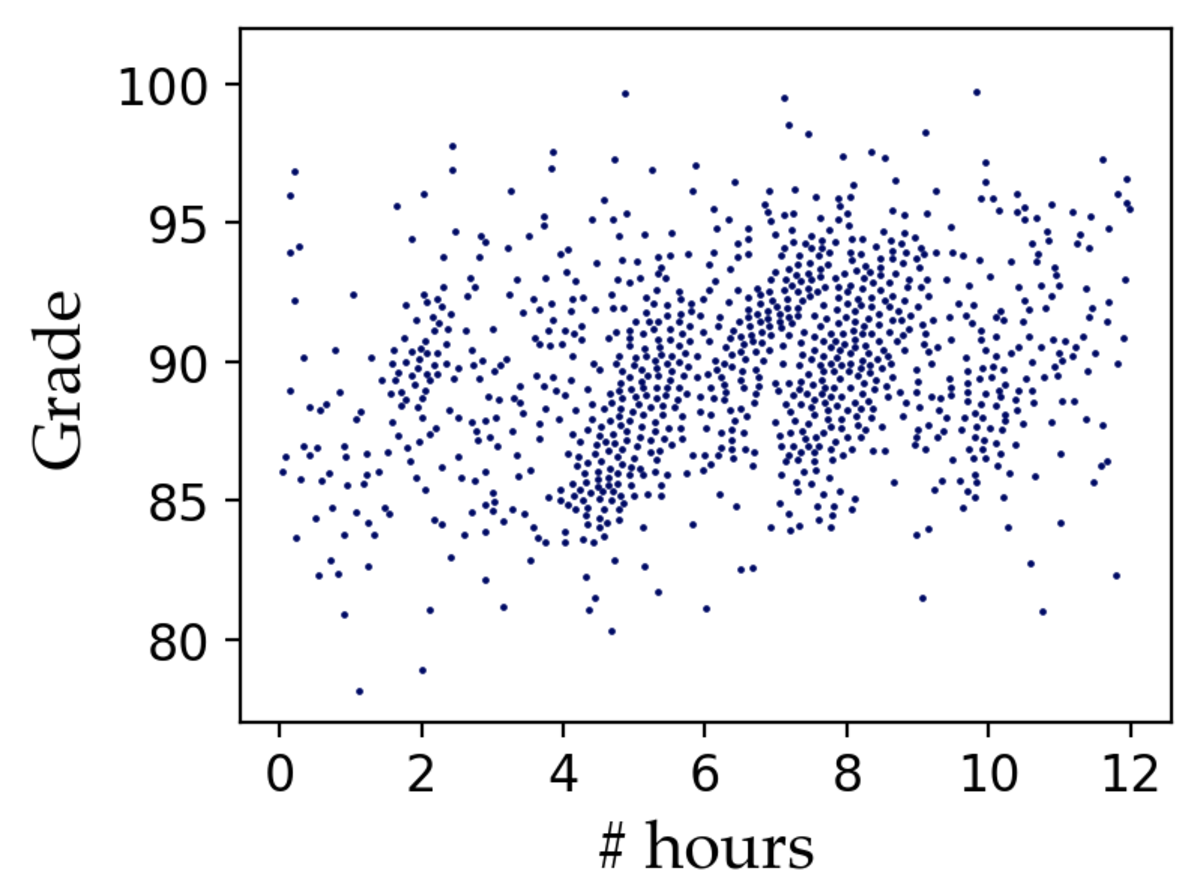
Figure 5: Perception weights for the dataset in Figure 1 (a). (b) A weight-based sample, which selects points with probabilities proportional to their perception weights, obscures the outlier trend and the two smaller clusters. (c) Max-Min provides coverage but fails to reveal clusters and trends in the data that are apparent in the saliency map.. a — Perception weights, b — Weight-based, c — Max-Min
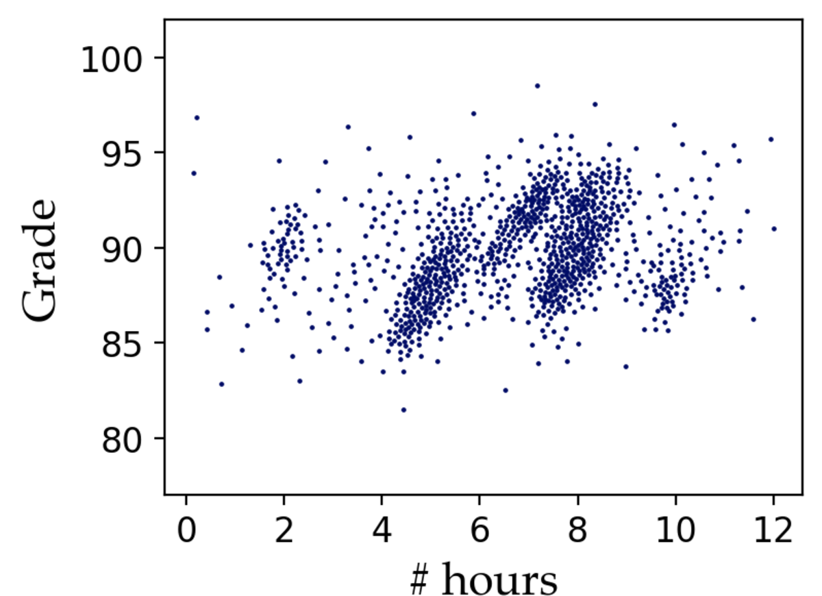
Figure 6: A human user is unlikely to detect that the approximate visualization (c), powered by our perception-aware compression, is automatically constructed and does not sample the underlying data (a). Our perception-aware sampling algorithm generates an actual sample (b), with similar properties as the approximate visualization.. a — Original data, b — Perception-aware, c — Approximate
Perception-awareness and coverage. GMM, a simple approximation algorithm for Max-Min diversification, relies on the farthest-first traversal heuristic [54]. GMM starts with a random point and keeps selecting the point whose minimum distance to previously selected points is maximized. We design a hybrid method based on the GMM algorithm that employs perception weights through a distance re-scaling mechanism. Our perception-aware sampling algorithm, PAwS, inherits the simplicity and intuition of Max-Min sampling, but re-scales the pairwise similarity scores of data points using the perception weights, thus balancing coverage and prioritizing points with high perception value. We describe PAwS in Section 3.
2.3 Approximate visualizations↩︎
In visual data exploration, analysts typically look for patterns, trends, and other insights, but they do not typically look at visualizations to read individual data points. In scatterplots in particular, humans are unlikely to visually perceive small value perturbations in the data, which means that we can allow inaccuracies in the presented data, as long as the visualization preserves the overall trends [37]. Our key insight is that we can generate an approximate visualization, that does not access or sample the real data at all. We achieve this through a novel perception-aware compression scheme, which works by fragmenting the visual canvas into rectangular regions with similar perception weights; considerations of area size and data density allow for adjusting the level of compression.
Figure 6 (c) demonstrates the approximate visualization generated by our ApproPAwS strategy. It displays the same number of points as our PAwS sample (Figure 6 (b)), but these points were not drawn from the original data; rather, ApproPAwS modies PAwS to select boxes from the compressed representation to sample from, and then draws points uniformly at random within a box. Yet, a human would be extremely unlikely to recognize that this is not an actual sample from the original data (Figure 6 (a)). Our ApproPAwS strategy closely emulates the behavior of PAwS, but because it works on the compressed representation and does not access the data directly, it can result in significant runtime gains in large datasets. We discuss the details of this method in Section 4.
2.4 Scope and practical considerations↩︎
Our goal in this paper is to establish that objectives targeting human perception (modeled via saliency) achieve more effective data samples compared to state-of-the-art sampling methods. We provide proof-of-concept implementation and demonstrate the effectiveness of perception-aware sampling through extensive quantitative experiments and a user study (Section 6). It is not our goal to evaluate how well state-of-the-art saliency models capture visual attention. This has already been established in prior work [32]–[36], and we use these state-of-the-art tools as blackboxes.
Saliency maps can be precomputed across specified pairwise combinations of data attributes; these could be determined by historical analyses, domain requirements, and feature selection techniques. The overhead of computing and storing saliency maps only depends on image resolution, and does not increase with the size of the data—e.g., for a 1084x924 image, the storage overhead is 438KB and the computational cost is 42 seconds, regardless of data size. This overhead does not impact the running time of our algorithms.
Conceptually, saliency maps are abstract “sketches” of the underlying data, its shape, and trends. Similar to sketching techniques for deriving synopses of data [55], saliency maps form synopses of the looks of a dataset. While it may be tempting to consider storing visualizations of the original data as images, this does not address the limitations on the amount of data a user can process nor overplotting, to which saliency models are more robust. Moreover, such images would be static, but data analysts rely on interactive visual exploration that allows for filtering, brushing, linking, or zooming operations, and sampling is a fundamental approach in the literature for designing such interactive visualization systems [18].
There are interesting challenges in optimizing the overhead of storing saliency for multiple candidate visualizations, which are called scatterplot matrices (SPLOMs) in the visualization literature [56]. Future work could leverage insights from the computer vision literature—such as saliency mix-up techniques [57], which blend salient regions across multiple images—as a potential direction for synthesizing saliency information across multiple views.
3 Perception Support and Sampling↩︎
In this section, we present our primary perception-aware sampling mechanism; Figure 7 provides a visual overview. The perception-augmented database augments the original data with saliency information for the target visualizations as meta data. At the time of sampling requests, the perception-augmented DB generates appropriate perception weights and deploys our perception-aware sampling algorithm (PAwS) to derive a sample of the requested size. We proceed to describe how we construct the perception-augmented DB and then present our sampling mechanism.

3.1 Perception-augmented database↩︎
Our perception-aware sampling mechanism is built on top of a novel perception-augmented database. We construct this perception-augmented database by precomputing and storing a perceptual model of the data for the given target visualizations.
Saliency aggregation. Different configurations of visual features (e.g., point size, opacity, canvas aspect ratio) can affect the appearance of a visualization and thus its saliency [1], [18]. Selecting a good configuration for a scatterplot is non-trivial and it is an active problem in visualization research [1], [6], [9], [18]. In Figure 8 (a), we render the same dataset with varying configurations for the point size (2–16) and opacity (0.1–1), with an aspect ratio of 1.25:1. Figure 8 (b) shows the saliency map that corresponds to each rendering. We observe that for small point sizes and opacity, the visualization highlights areas of higher population density, and the corresponding saliency maps identify these areas as more salient. For large point sizes and opacity, more areas of the visualization appear dense, and the attention focus tends to shift towards the outskirts and outliers. Focusing on a particular configuration and saliency would therefore potentially miss important perspectives in the data that become salient under different configurations. For a more robust perception model, we aggregate saliency information across a broad range of configurations (Figure 8 (c)). In our implementation, we use the maximum saliency value of each pixel across all configurations, but other aggregation options are possible.
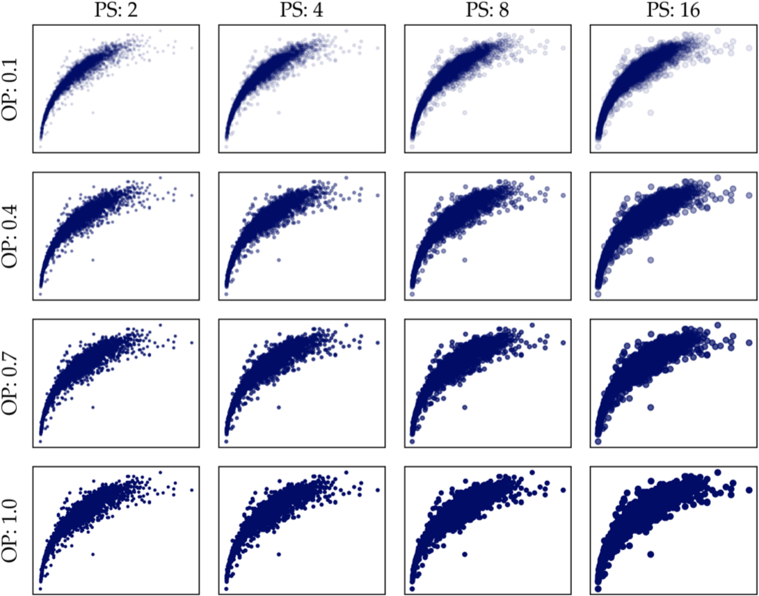
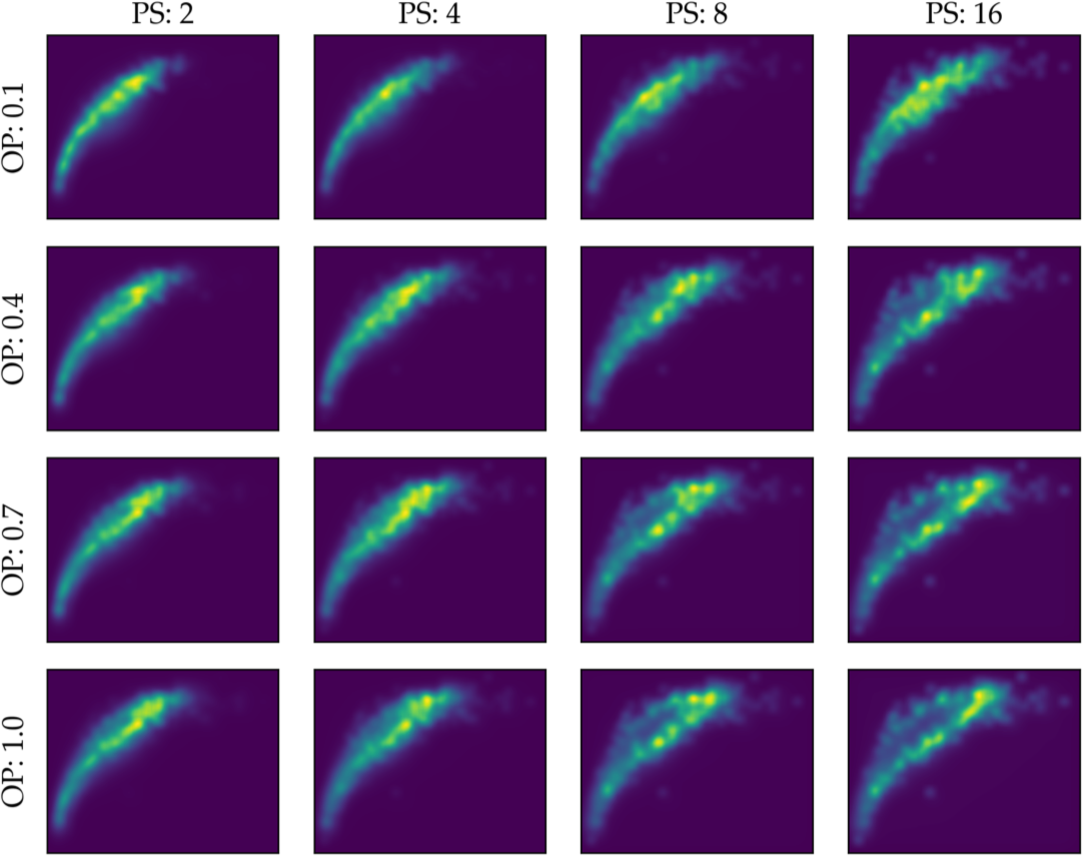

Figure 8: The same dataset will look different with different point size and opacity configurations (a), which will translate to different saliency maps (b). Our model aggregates the saliency across varied stimuli to capture all these perspectives (c).. a — Stimuli variations, b — Saliency maps, c — Aggregate saliency
Deriving perception weights. The perception-augmented database stores two pieces of information as meta data: the aggregate saliency map (a 2D matrix assigning saliency values to pixels) for the target visualization, and a density score \(q_d\) for each data point. The system derives a per-tuple saliency score \(q_s\) on the fly (with negligible overhead), by assigning to each datapoint the corresponding pixel value. The density score is precomputed using non-parametric kernel density estimators [58]–[60], assigning higher density weights to points in highly dense areas. The perception-augmented DB then derives a perception weight for each point as \(w_p= \max(q_s, \gamma \cdot q_d)\), where \(\gamma \in [0, 1]\) controls the influence of density. The system adaptively sets \(\gamma\) based on the variance of density weights: when variance is low, density adds little information as all areas have similar density (\(\gamma\) approaches zero); when variance is high, density plays a larger role. In our experiments, we map the density variance of a dataset into a sigmoid function, assigning \(\gamma\) values closer to one for datasets with larger density variance.
3.2 Perception-aware data selection↩︎
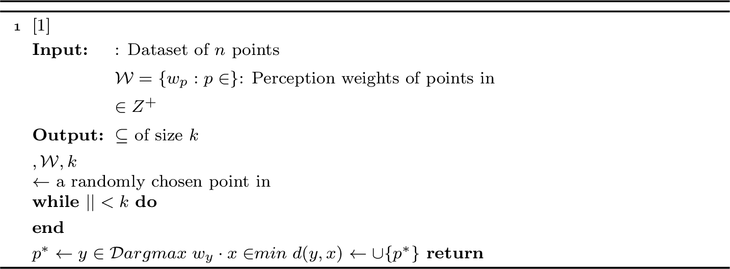
Users can query the perception-augmented DB to retrieve a sample of the desired size for their target visualization. The perception-aware DB invokes PAwS(Algorithm 9) on the dataset \(\mathcal{D}\) of size \(n\), with target visualization \(V\) and desired sample size \(k < |\mathcal{D}|\). We assume a metric distance function \(d: \mathcal{D}\times \mathcal{D}\rightarrow \mathbb{R}_{0}^{+}\) representing the pairwise similarities of points over the two visualization attributes and a set of perception weights \(\mathcal{W}= \{w_{p_1}, w_{p_2}, \ldots, w_{p_n}\}\) that the DB computes on the fly.
Our goal is to select a sample \(\mathcal{D'}\subseteq \mathcal{D}\) of size \(k\) that maximizes the perceptual similarity of \(\mathcal{D'}\) to the original dataset \(\mathcal{D}\), i.e., the similarity of the saliency maps of \(\mathcal{D'}\) and \(\mathcal{D}\) should be maximized. We use coverage and perception scores as proxies towards this objective. PAwS follows a greedy strategy, adapted from Max-Min sampling: It initially selects a random point, and proceeds to augment the sample \(\mathcal{D'}\) greedily, by adding the point \(p^*\) with the largest multiplicative score of its perception weight (\(w_{p^*}\)) and distance from the current sample (\(\min_{x \in \mathcal{D'}}d(p^*, x)\)). Thus, the objective penalizes points that have low perception weights, or points that are too close to the existing sample. This strategy is analogous to data augmentation techniques in computer vision that balance saliency and coverage [43].
Running time. To maintain the pairwise distances of each point to the sample (line [ln:dist]), we only need to recompute distances to each newly-added point, resulting in \(O(kn)\) running time. Similar implementations have been used in the literature [53], [61].
4 Approximate Visualizations↩︎
Sampling operations should be fast, to avoid hindering visual analytics workflows. While PAwS is faster than several state-of-the-art approaches (as we will see in Section 6), further boosting efficiency and scaling is desirable. In this section, we discuss an extension to the functionality of the perception-augmented database that allows for several orders of magnitude speed-up in sampling times on large datasets. Our approach relies on a fundamental limitation in human perception: humans are typically unable to perceive small perturbations in visualized data (recall the example of Figure 6). This means that, as long as our perception goals are met, we do not need accurate data values in the sample.
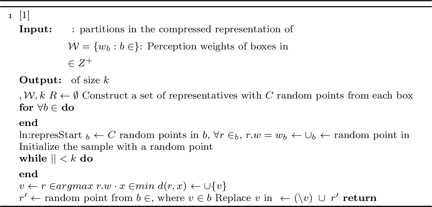
Figure 10 demonstrates the high-level workflow of our approximate visualization module. The perception-augmented DB uses a quad-tree partitioning scheme to produce a compressed representation of the data based on the perception model. Roughly, the compressed representation fragments the canvas area into bounding boxes of different sizes, so that the data that falls within each box is somewhat evenly distributed and has similar perception weights. Our adapted sampling algorithm, ApproPAwS(Algorithm 12), generates a set of representative points for each box, drawn uniformly at random within the box area. It then greedily selects a point at a time, based on a combination of perception and coverage objectives (like PAwS), replacing the point with another random one in the same box. ApproPAwS achieves runtime gains simply on the premise of working over a small dataset of randomly-drawn points, so these gains are more pronounced the larger the original data is.

4.1 Perception-aware compression↩︎
We create a compressed representation of the dataset \(\mathcal{D}\) over the two dimensions relevant to the target visualization. Our compression mechanism splits the visualization canvas in a quad-tree hierarchical partitioning fashion: any cell that fails to meet certain data distribution or perception homogeneity requirements (discussed below) is split into four smaller cells. The partitioning terminates with a collection of non-overlapping bounding boxes of different sizes, such that (1) data is close to uniformly distributed within each box, and (2) datapoints within each box have roughly similar perception weights. We explain these criteria below.
Data approximation. Our approximation scheme draws uniform random samples from a box in the compressed representation, instead of accessing the actual data. The compression scheme ensures that, for each box, a sample drawn uniformly at random is close enough to true data points. We use the Chamfer (pseudo)-distance (CD), a commonly-used metric in the computer vision literature for designing generative neural network models for reconstructing 3D point clouds [21], [62], [63]. It compares the similarity of two unordered sets of points \(\mathcal{S}_1\), \(\mathcal{S}_2\) as follows: \[d_{CD}(\mathcal{S}_1 , \mathcal{S}_2) = \dfrac{1}{2} \left( \dfrac{1}{|\mathcal{S}_1 |}\sum_{x \in \mathcal{S}_1} \underset{y \in\mathcal{S}_2}{\text{min}} ||x - y||_{2} \;+ \;\dfrac{1}{|\mathcal{S}_2|}\sum_{y \in \mathcal{S}_2} \underset{x \in \mathcal{S}_1}{\text{min}} ||x - y||_{2} \right)\]
The Chamfer distance measures how close every point in the actual data \(\mathcal{S}_1\) is to their nearest neighbor in the random sample \(\mathcal{S}_2\), and vice versa, and computes the average. A box is split if \(d_{CD}\) is above a preset threshold \(\lambda\).
Perception homogeneity. Similarly, because we want the generated datapoints to appropriately represent the true data, the compression also ensures that datapoints within each box have similar perception weights. We split a box if the variance of perception weights within it is higher than a preset threshold \(\sigma\).
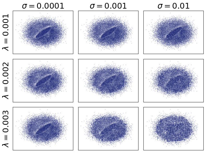
Figure 11 (a) shows a visual representation of the compression of a dataset for varied values of \(\lambda\) and \(\sigma\). These thresholds affect the number of boxes in the final compression. Intuitively, more boxes result in lower compression and lower distortion of the final visualization. In this case, we see the lowest compression in the upper left corner and the highest compression in the lower right corner of Figure 11 (a). Figure 11 (b) shows the corresponding approximate visualizations for each compression (produced by ApproPAwS, discussed next). We note that even at the lowest compression (most boxes), the size of the representation is only 1.2 MB; the resulting visualization achieves perceptual similarity on par with PAwS, with a runtime that is about 100x faster (Section 6.2).
4.2 Approximate PAwS↩︎
Given a perception-aware compression, ApproPAwS(Algorithm 12) generates a sample with points drawn from the compressed representation, rather than from the actual data. Intuitively, ApproPAwS operates exactly like PAwS, but instead of performing data selection over the actual data, it generates and maintains a small representative dataset \(\mathcal{R}\) on the fly. The algorithm initializes \(\mathcal{R}\) by generating uniformly at random a small, constant number \(C\) of points from every box in the compressed representation (lines [ln:represStart]–[ln:represEnd]). Using \(C>1\) makes the algorithm robust to poor random draws (e.g., a box never getting picked due to a poor representative). When a point is added to the sample, a new representative from the same box replaces that point in \(\mathcal{R}\) (line [ln:replace]). Even though ApproPAwS does not access the actual data, the construction of the compressed representation ensures that the random points drawn from the boxes conform to the data distribution and perception levels of the original data.
Running Time. Algorithm 12 has runtime complexity \(O(k^2 + k \;C \;|\mathcal{P}|)\). The first factor is due to computing the distance of a new representative to the current sample at each step. The second factor corresponds to PAwS’s \(O(kn)\) complexity, but replaces \(n\) with \(C \;|\mathcal{P}|\), where \(C\) is the number of points we draw from each box (a small constant), and \(|\mathcal{P}|\) is the number of boxes in the compression. ApproPAwS has pronounced gains for large datasets (\(|\mathcal{P}| << n\)); if \(n\) is small its performance may degrade due to the additional factors.
5 Perceptual Similarity Metrics↩︎
A key insight in our work is that a sample should distort saliency as little as possible. We use well-established image- and distribution-based metrics to measure how similar the saliency of a sample is to the saliency of the original data.
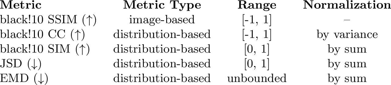
Measuring perceptual similarity. Saliency maps are stored and visualized as images; thus, we use a well-established image-based metric as our primary metric: Structural Similarity Index Measure (SSIM) [44]. We further evaluate four distribution-based metrics from the saliency literature [34]. These metrics treat a saliency map as a distribution over pixels and measure how accurately a saliency model predicts the attention focus areas of a dataset.
; [image-based] is a well-known image similarity metric, frequently used as a loss function in computer vision problems [64], [65]. With two images split into fixed-size windows, the SSIM score is the mean of similarity scores across windows measured over luminance \((\ell)\), contrast \((c)\), and structure \((s)\), i.e., \(\mathrm{SSIM}(\theta_1, \theta_2) = \ell(\theta_1, \theta_2)^{\alpha} \cdot \c(\theta_1, \theta_2)^{\beta} \cdot s(\theta_1, \theta_2)^{\gamma}\). If \(\alpha=\beta=\gamma=1\), all three terms affect the score equally, while each term in the product depends on statistical information like the mean pixel value and variance of pixel values of an image window.
; [distribution-based] measures linear correlation across two random variables. We standardize the saliency maps \(\mathcal{M}(V_{\mathcal{D'}})\) and \(\mathcal{M}(V_{\mathcal{D}})\) and measure their correlation as: \[\mathrm{CC}(\mathcal{M}(V_\mathcal{D'}), \mathcal{M}(V_\mathcal{D})) = \dfrac{\mathrm{COV}(\mathcal{M}(V_\mathcal{D'}), \mathcal{M}(V_\mathcal{D}))}{\sigma(\mathcal{M}(V_\mathcal{D'})) \cdot \sigma(\mathcal{M}(V_\mathcal{D}))}\] CC takes values in the \([-1, 1]\) range where higher values indicate higher correlation (higher similarity). A value of 0 indicates no correlation (low similarity).
; [distribution-based] measures the similarity of two distributions by computing a histogram intersection. We normalize the saliency maps to derive the distributions \(p_{\mathcal{D'}}\) and \(q_{\mathcal{D}}\) over \(I\) pixels, and compute SIM as follows: \[\mathrm{SIM}(p_{\mathcal{D'}}, q_{\mathcal{D}}) = \sum_{i \in [I]} \mathrm{min}\big(p_{\mathcal{D'}}(i), q_{\mathcal{D}}(i)\big)\] For every pixel of the saliency maps, we take the minimum probability value between the sample and the dataset distribution. SIM takes values in the [0, 1] range: a value equal to \(1\) indicates a perfect distribution match, and \(0\) no match at all.
; [distribution-based] measures dissimilarity between two probability distributions. We normalize the saliency maps to derive distributions \(p_{\mathcal{D'}}\) and \(q_{\mathcal{D}}\) and compute: \[JSD(p_{\mathcal{D'}}, q_{\mathcal{D}})= \tfrac{1}{2}D_{KL}(p_{\mathcal{D'}}||\mu) + \tfrac{1}{2}D_{KL}(p_{\mathcal{D'}}||\mu)\] where \(\mu\) is the point-wise mean of \(p_{\mathcal{D'}}\) and \(q_{\mathcal{D}}\). \(D_{KL}\) is the KL-divergence, defined as: \[D_{KL}(p_{\mathcal{D'}}||\mu) =\sum_{i \in [I]} p_{\mathcal{D'}}(i) \log\left(\tfrac{p_{\mathcal{D'}}(i)}{\mu(i)}\right)\] JSD is a symmetric version of KL-divergence and takes values in the \([0, 1]\) range. Lower values indicate higher similarity: e.g., the JSD of two identical distributions is equal to zero.
; [distribution-based] measures the spatial dissimilarity across two distributions over a metric space. The distributions \(p_{\mathcal{D'}}\) and \(q_{\mathcal{D}}\) are two-dimensional histograms with a number of bins equal to the resolution of the saliency maps. Given a function that models the pairwise cost of moving a unit of probability mass from one bin to another, EMD is equal to the minimum cost of transforming one distribution into the other, and is computed by solving an optimal transportation problem [34], [66], [67]. Computing EMD involves solving a linear program, which can be impractical to compute for large image sizes. Thus, we follow the methodology of Bylinskii et al. [34], and reduce the size of the saliency images to \({\sim}1/32\) of their original resolution. We use an open-source library for the implementation,2 and highlight that, even for reduced image sizes, EMD is computationally expensive.
Discussion. All the above metrics are well-established in the literature. We note that interpreting their behavior and the mechanism based on which they penalize mismatches across saliency maps is a separate research area and is not straightforward [34], [68]. For example, CC is affected symmetrically by false positives and negatives (indicating an area is salient when it is not and vice versa), while SIM is mostly affected by false negatives [34]. We refer the reader to the in-depth experimental evaluation by Bylinskii et al. [34] for a better understanding of the metrics’ behavior, and guidelines on how to use them in practice.
A separate research question is how well these metrics align with human perception [69]. For instance, despite popular belief that SSIM is a perceptual-based similarity metric for images, there have been known cases in the literature where human judgment does not align well with the SSIM score [68]. Thus, designing better metrics for image similarity is still an active research problem [70]. It is not the focus of this work to contribute better and more robust similarity metrics; we lean on the state-of-the-art and use a variety of metrics to guide our evaluation.
6 Experimental Evaluation↩︎
In this section, we present an extensive evaluation, including a user study, of our perception-aware sampling methods, against five state-of-the-art and baseline approaches, over six datasets with diverse characteristics. Our experiments demonstrate that PAwS robustly outperforms other methods in producing samples that are perceptually similar to the original data, and achieves desirable levels of perceptual similarity at lower sample sizes. It is also orders of magnitude faster than competing state-of-the-art on large datasets (Section 6.1). Moreover, the approximate visualizations of ApproPAwS achieve similar levels of perceptual similarity to PAwS, with 100x gains in runtime performance on our largest dataset of \(\sim 3.5\)M data points. (Section 6.2).
We proceed to describe our datasets, state-of-the-art sampling algorithms, and baselines. We used Python 3.8 for the code implementation and ran the experiments on one cluster node with a 2.3 GHz 8-Core Intel Core i9 and 16 GB RAM.
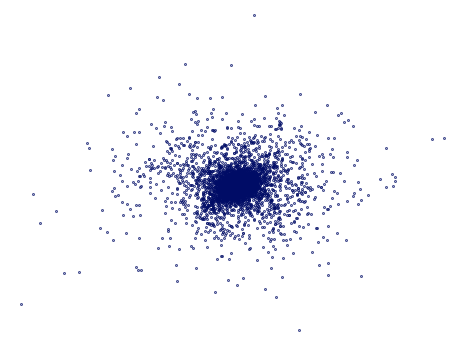
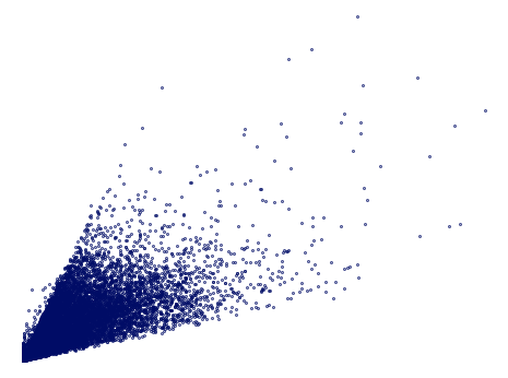
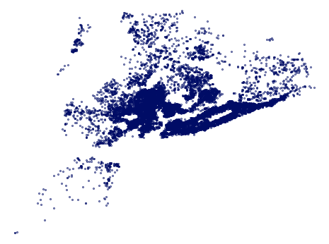
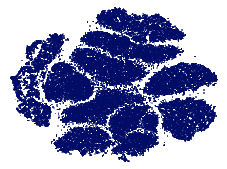
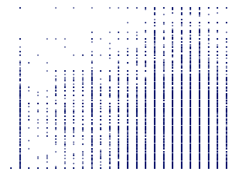
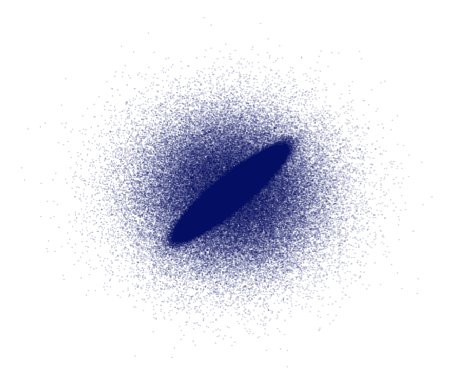
Figure 14: Visualizations of datasets used in our evaluation.. a — Epileptic Seizure, b — Estate Correlation, c — Estate GIS, d — MNIST, e — ACSI, f — Hidden Correlation
Datasets. We collected six datasets with a diversity of patterns, underlying trends, and sizes ranging from 11.5K to 3.5M points. We embed all datasets into a 2D space for the scatterplot visualizations, normalized in the \([0, 1]\times[0, 1]\) range (shown in Figure 14).
; [71] consists of \(70,000\) images for different handwritten digits and is commonly used in the visualization literature for clustering analysis and perception research [2], [6]. We use a version of the dataset projected onto \(2D\) space using the t-SNE dimensionality reduction method.3
; is a dataset of New York real estate pricing4, which consists of \(17,614\) entries and 8 continuous attributes. We selected two moderately correlated attributes for the visualization.
; reuses the New York real estate pricing dataset (\(17,614\) entries) with two different visualization attributes resulting in a shape most suitable for outlier detection.
; [72] describes EEG information5. The dataset has \(11, 500\) entries with 178 attributes. We selected two uncorrelated attributes for the visualization.
; [73] is one of the ACS datasets for research in fair machine learning. It consists of \(250,847\) entries and 6 continuous attributes. We chose two attributes that visualize into an abacus-like shape with no specific trend.
; is a synthetic two-dimensional dataset that consists of \({\sim}3.5\) million records. \(97.5\%\) of the dataset consists of highly correlated points (\(\rho=0.9\)) while \(2.5\%\) of non-correlated points (\(\rho=0\)). Due to high visual cluster, the correlation trend is often obscured in the visualization. Depending on the sampling methods, the correlated points and uncorrelated points may be sampled at different rates, driving the user to see correlations of varying strengths, thus making this synthesized dataset an ideal test bed for perception-aware sampling methods.
Methods. Our evaluation compares our algorithms (PAwS and ApproPAwS) against five baselines, including probabilistic-based methods (Random and DBS), diversity-based methods (Max-Min and Vas), and other state-of-the-art (Blue-noise):
; is our primary algorithm for selecting perception-aware samples using the saliency models stored in a perception-augmented database (Section 3).
; is our approximate visualization method, which generates samples through perception-aware compression (Section 4).
; is standard uniform random sampling, an extremely common method, owing to its simplicity and accessibility [2], [20].
;, also known as Farthest-point sampling [50], [54], selects a sample \(\mathcal{D'}\subseteq \mathcal{D}\) of size \(k\) that maximizes the minimum distance across the selected points. We use GMM [54], a greedy approximation algorithm (\(O(kn)\)) that starts with a randomly-selected point and adds the point farthest from the sample at every step.
; is a visualization-aware sampling method for scatterplots [16]. It selects a sample \(\mathcal{D'}\subseteq \mathcal{D}\) of size \(k\) such that for any point \(x \in \mathcal{D}\) \(\exists \;y \in \mathcal{D'}\) that is close enough to \(x\). Closeness is controlled through a user-specified parameter \(\epsilon\).6 Vas uses the Expand + Shrink (ES) local search algorithm, which starts with a candidate solution of \(k\) points and keeps swapping a point at a time until no swap offers improvement. Typically, ES converges to a solution in less than half an hour [16]. Park et al. [16] discuss a runtime optimization using R-trees, but only recommend it for sample sizes of more than 10K points. For smaller sizes, the overhead of maintaining the R-tree dominates the running time. In this work, we implement the vanilla version of the ES algorithm and refer to the original paper for analyzing improvements in running time.
; probabilistically over-samples points in sparse areas and under-samples points in dense areas [22]. We use an open-source implementation [2] that employs a KNN neighbors algorithm and samples a point with a probability proportional to its K-farthest neighbor distance.7 A large distance implies that the point is likely in a sparse area and thus has higher probability of being selected.
; sampling selects a set of points that are at least some radius \(r\) far apart from each other, for some pre-specified value of \(r\) [29]. A common implementation uses the dart-throwing technique [74]: given a sampling radius \(r\), the algorithm randomly selects a point; if the point’s distance from the sample is greater than \(r\), then it is added to the sample, and it is rejected otherwise. After a certain number of rejections, the algorithm reduces the value of \(r\) to reach the desired sample size. We note that the setting of \(r\) affects the algorithm’s behavior: the smaller the \(r\), the more the algorithm focuses on prioritizing dense areas. Blue-noise aims for a balanced representation across sparse and dense areas, and thus optimizes for data shape and coverage. We use the open-source implementation of Yuan et al. [2].

Figure 15: PAwS prioritizes the selection of data points in salient and high-density areas, while providing data coverage. Max-Min and Vas optimize for coverage, and may fail to preserve trends (e.g., in hidden correlation). Random and DBS preserve relative density, while Blue-noise aims for a balanced representation among dense and sparse areas, but its behavior varies and sometimes behaves like random sampling.. a — MNIST, b — Hidden correlation
Experimental design. Here, we discuss our methodology, sample sizes, and other parameter and design choices.
Scatterplot rendering and perception weights. As we discussed in Section 3.1, visual features, such as point size and opacity, affect the saliency of a visualization. The effect can be significant; e.g., in hidden correlation, the correlation trend is only visible for small marker size and low opacity (Figure 14 (f)). Our perception-augmented DB stores aggregate saliency maps over visual configurations varying point size (PS: {2px, 4px, 8px, 16px}) and opacity (OP: {10%, 40%, 70%, 100%}), on a fixed canvas size \(14 \;\mathrm{in} \times 12 \;\mathrm{in}\) (i.e., aspect ratio of \(1.16\) and resolution \(1,085 \times 924\)). The aggregate saliency map is projected onto the data to derive weights, which are then augmented with density information.8
Perceptual similarity. We express the perceptual similarity of two visualizations as the similarity between their saliencies. Since visual features affect perception and saliency, we use 16 configurations with the point size and opacity settings discussed above to generate saliency maps for the original data and each sample. We compare the saliency similarity of each pair (original and sample) with the same configuration, and compute the final perceptual similarity as the average across all 16 configurations. We report this average score along with a \(95\%\) confidence interval across the 16 configurations, and do the same for all five metrics (Section 5).
Sample sizes. We select sample sizes using the Weber-Fechner Law, which states the relationship between change in stimulus and perception is logarithmic [77]—this methodology is favored in the visualization literature. We follow Yuan et al. [2] and experiment with sample sizes \(\{250, 375, 844, 1898, 4271, 9611\}\), defined by the geometric series \(\{250 \times 1.5^0, 250 \times 1.5^1, 250 \times 1.5^3, 250 \times 1.5^5, 250 \times 1.5^7, 250 \times 1.5^9\}\), where \(1.5\) is a constant value in the methodology proposed by the authors [2].
6.1 Perceptual quality of sampling methods↩︎
In this section, we evaluate all methods with respect to their ability to avoid perceptual distortion in the resulting visualizations. We first discuss the behavior of different algorithms, as this is showcased through some qualitative results, and then report on the perceptual similarity scores samples achieve across all metrics. We further evaluate humans’ preferences over samples through a user study, and put results in context with their runtime performance.
Figure 15 showcases samples produced by each method on two of our datasets. Since Max-Min and Vas optimize for coverage, they select points that are evenly distributed across the data space, and can fail to capture trends at small sample sizes. On the other hand, Random and DBS prioritize areas of density, thus failing to capture the overall shape. Blue-noise achieves better balance by adaptively prioritizing the selection of points in sparse and dense areas, but behaves like random sampling on the hidden correlation dataset. PAwS prioritizes points in areas of high perceptual significance without sacrificing coverage, resulting in samples that represent well the overall shape and trends. In Figure 15 (b), PAwS is the only method that preserves both the data shape and correlation trend.
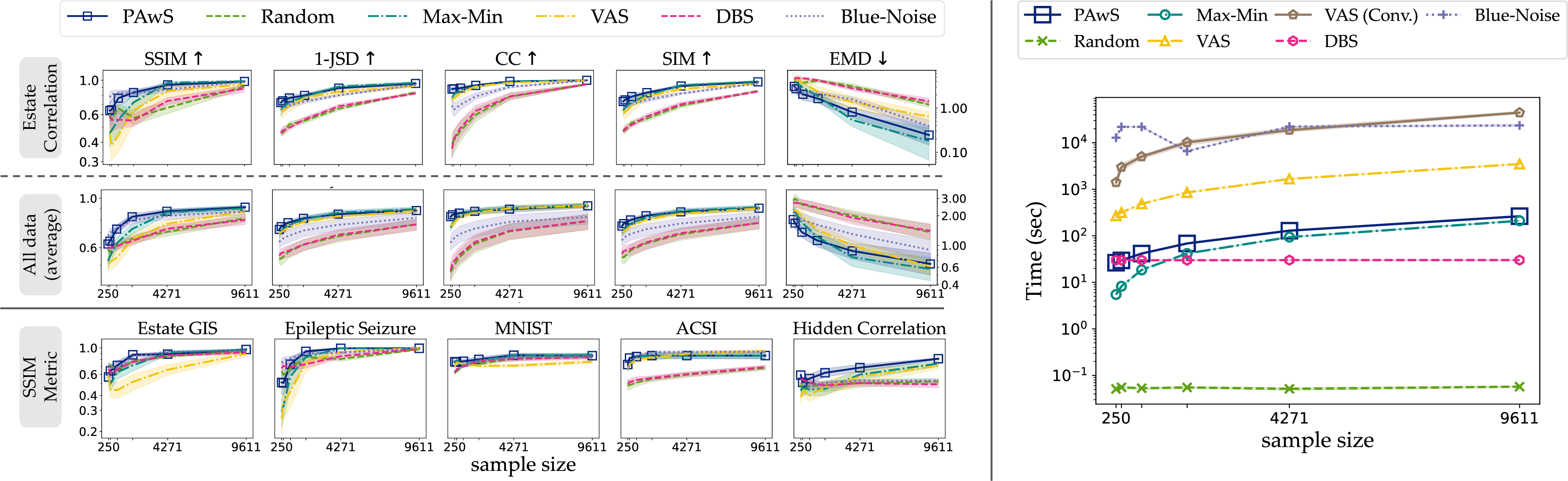
Figure 16 reports quantitative results on the efficacy and efficiency of all algorithms. Due to space limitations, we omit or summarize some results; we refer the interested reader to Appendix 9 . On the left side of Figure 16, we report on each sampling algorithm’s effectiveness at producing perceptually good samples, using our five metrics. The first row of plots ( ;) shows the perceptual similarity achieved by all algorithms in samples generated over the Estate Correlation dataset. PAwS achieves high scores across all metrics and sample sizes. The performance of other methods varies a bit across metrics, but generally, Max-Min, Vas, and Blue-noise lag in perceptual similarity scores until the sample size gets larger. Random and DBS achieve much worse scores than the other algorithms.
In the second row ( ;), we average the perceptual similarity scores for each method across all datasets, to provide a more holistic view of the algorithms’ behavior. The probabilistic methods consistently underperform, with respect to all metrics. The relative performance of Max-Min, Vas, and Blue-noise varies across the different metrics, but what remains constant is that PAwS demonstrates superior performance with respect to all metrics. These results also demonstrate that PAwS needs smaller sample sizes to achieve a certain level of perception similarity. E.g., PAwS scores 0.75 SSIM similarity on average for a sample of 844 points, when Vas needs 5x bigger sample.
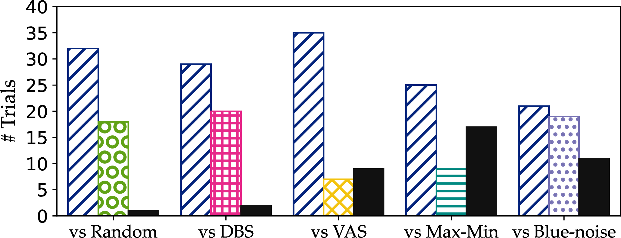
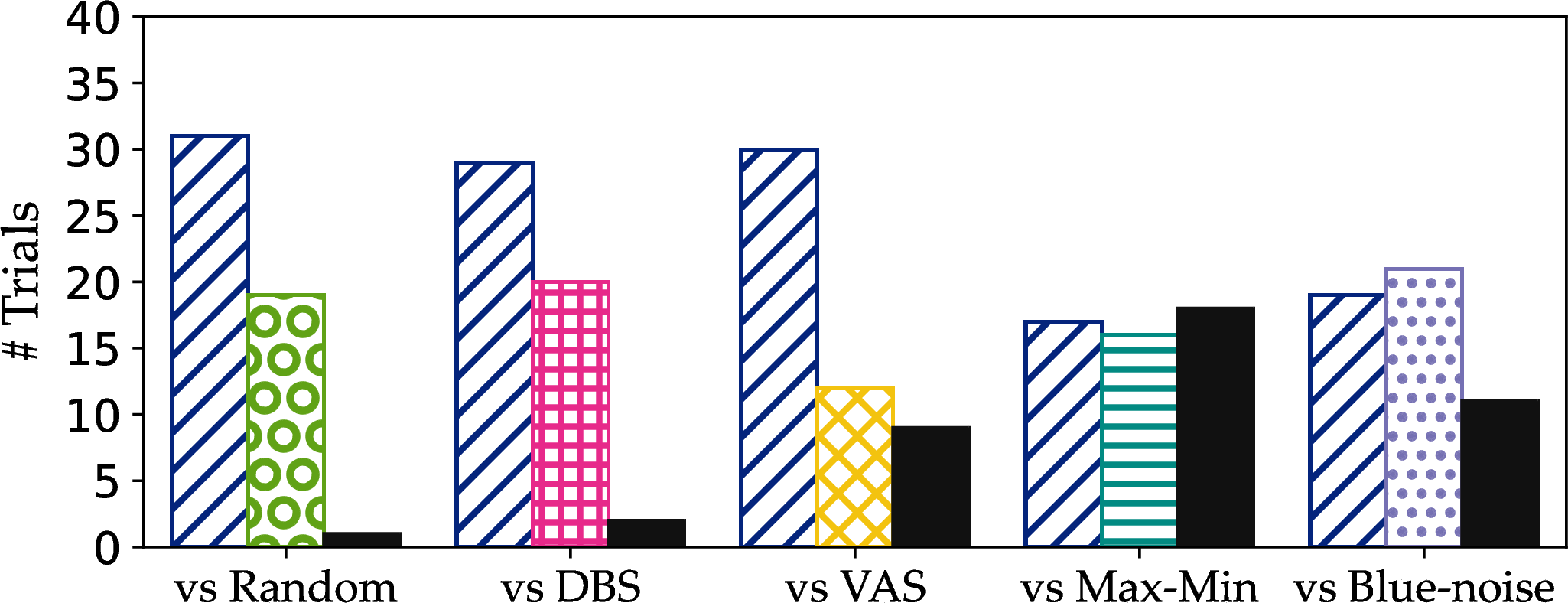
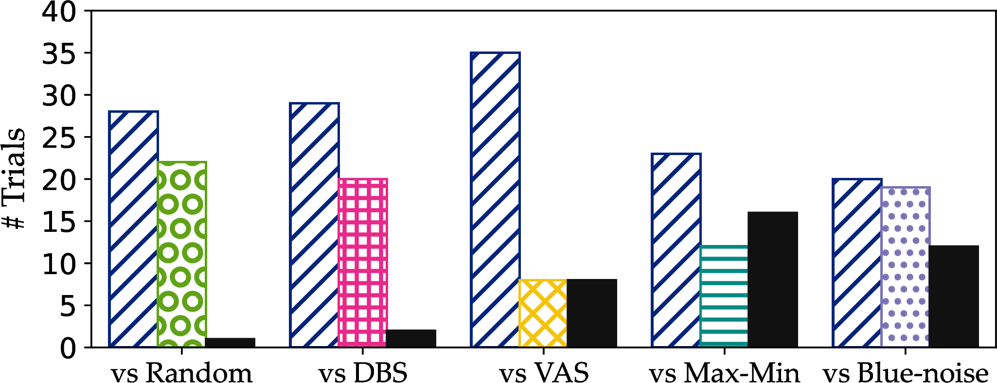

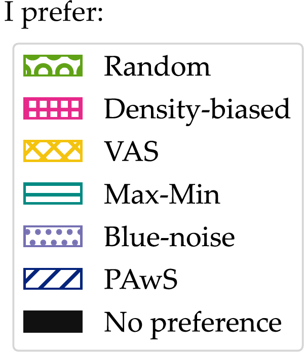
Figure 17: In one-to-one matchups against the state-of-the-art, users largely prefer PAwS with respect to (a) representation of correlation trends, clusters, and other patterns, (b) representation of outliers and overall data shape, and (c) representation of density variations. Vas is slightly preferred in the “best overall” category (d), but it is computationally prohibitive. PAwS is preferred overall against all other methods.. a — Trends and patterns, b — Outliers and data shape, c — Density preservation, d — Best overall
The third row ( ;) reports the algorithms’ performance across five datasets (the corresponding plot for the Estate Correlation dataset appears in the first row), focusing on the SSIM metric, which is our only image-based metric. We note that it is normal for sampling behavior to vary across datasets, given the different shapes and trends, or lack thereof. However, we observe that PAwS robustly achieves high scores across all datasets, and outperforms other methods in most cases. We note that, intuitively, perceptual similarity increases as sample sizes grow for all methods, so differences are often more pronounced at smaller sizes. On the MNIST data, all methods are close in similarity scores; this is due to the clustering structure and even density across data regions, which allows perception-agnostic methods to perform well despite their limitations. In ACSI, the probabilistic methods are distinctly worse, but the others achieve similar results.
Runtime performance. We discuss the runtime performance of the algorithms on the Hidden Correlation dataset (\(\sim\! 3.5M\)), which is the largest one in our evaluation (Figure 16, right). PAwS and Max-Min are the fastest among algorithms with reasonable perceptual efficacy. Their runtimes are similar, because they implement the same algorithm with modified objectives. While Random and DBS are faster, they typically produce samples of poor perceptual quality. The KNN algorithm, which is used by DBS to identify points in sparse areas, dominates its running time, which stays constant across sample sizes. The runtimes of Vas and Blue-noise are significantly longer, by 2–3 orders of magnitude. Vas takes a long time to converge (\({\sim}23\) minutes for a sample of 250 points), though we have observed that it produces samples of similar quality after one pass over the data (\({\sim}5\) minutes for a sample of 250 points). Figure 16 reports both runtimes (till full convergence and for a single pass). We note that Blue-noise is extremely inefficient (\({\sim}3.6\) hours for a sample of 250 points), which aligns with prior analyses [6], [30].
User study. We conducted a user study to assess how humans perceive PAwS samples against each of the other baselines, across all datasets in our study. We recruited 17 Computer Science students (\(\mathrm{Mean}_{\mathrm{age}}=27\), \(\mathrm{SD}_{\mathrm{age}}=3.4\)) familiar with statistical concepts, verified through a few simple questions. In each task, participants viewed the full dataset—where they could adjust marker transparency—and compared a PAwS sample against one alternative baseline at a time (a total of five sample pairs). For each sample pair, we asked participants to select the sample that is best at (a) preserving correlation trends, clusters, and other patterns, (b) retaining outliers and overall data shape, and (c) preserving density variations. Finally, we asked participants to select the overall best sample in each pair (Figure 17 (d)). For each question, participants could select “sample 1”, “sample 2”, or “no preference”. For each dataset, we chose sample sizes between 0.3 and 16% of the data size (more details in Appendix 9 ).
Figure 17 presents aggregated results across all datasets and participants: i.e., \(\sim\!50\) trials per sample pair. For each matchup, we report how often users preferred PAwS, how often they preferred the alternative baseline, and how often they declared no preference. The closest in user preference is Blue-noise, which ends up slightly overtaking PAwS in the “overall best” category, but, as we discussed, Blue-noise is computationally prohibitive. Users show strong preference for PAwS against all other alternative methods. In particular, probabilistic-based methods generally rank below PAwS, but we observed participants only decisively prefer PAwS when those methods fail to capture shape and outliers (as is the case on Hidden Correlation and ACSI). We show a per-dataset analysis of the results in Appendix 9 .
6.2 Performance of approximate visualization↩︎
In this section, we evaluate the effectiveness of approximate visualizations generated by ApproPAwS(Algorithm 12), using our perception-aware compression (Section 4.1). Compression splits the canvas area into non-overlapping bounding boxes based on two thresholds, \(\lambda\) and \(\sigma\), controlling data approximation and homogeneity of perception weights, respectively. These parameters affect the level of compression implicitly: lower thresholds result in more and smaller boxes (lower compression), thus, sample points drawn randomly within a box match better the underlying data and lead to lower distortion (example in Figure 11). We present results at three compression levels: (1) low: \(\langle \lambda, \sigma \rangle= \langle 0.001, 0.001 \rangle\), (2) medium: \(\langle \lambda, \sigma \rangle= \langle 0.002, 0.001 \rangle\), and (3) high: \(\langle \lambda, \sigma \rangle= \langle 0.003, 0.01 \rangle\). For the ACSI dataset, we alter the medium and high levels slightly, to \(\langle \lambda, \sigma \rangle= \langle 0.005, 0.001 \rangle\) and \(\langle \lambda, \sigma \rangle= \langle 0.01, 0.01 \rangle\), respectively. We note that the derived compressions may differ in the number of boxes: e.g., hidden correlation has 9\(,\)658, 4\(,\)042, and 993 boxes across the three levels (Figure 11 (a)), while estate correlation has 3\(,\)491, 1\(,\)184, and 448 boxes. We give more details and context on these choices in Appendix 9 . In practice, the thresholds can be tuned by data analysts using a grid search approach to reach the desired level of compression.
Figure 18 contrasts the perceptual quality of ApproPAwS samples at 3 compression levels with PAwS. We report the methods’ similarity scores at sample size \(k=9,611\)—intuitively, distortion due to compression becomes more visible in larger sample sizes.
We note that ApproPAwS achieves excellent scores on the first four metrics, closely matching the performance of PAwS. We achieve high performance even at the highest compression level. Still, the trend that perceptual quality increases as compression decreases remains visible. We note that values better than PAwS are possible, though uncommon; we observe them on the ACSI dataset, which models a corner case in scatterplots, and the EMD metric, which is known in the literature to have less consistent behavior, and to be more difficult to optimize for, and “prefers sparser predictions, even if they do not perfectly align with fixated regions” [34].
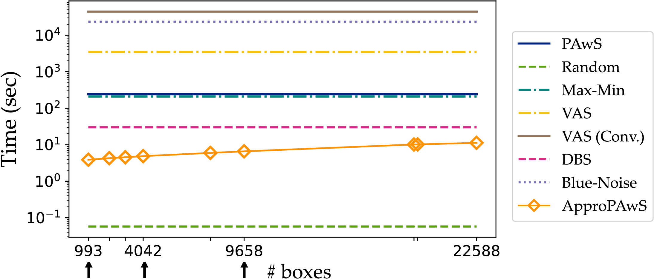
Runtime performance. Figure 19 demonstrates how the running time of ApproPAwS scales as compression decreases. We use the largest sample size (\(k\)=9\(,\)611) and largest dataset (hidden correlation) in our evaluation, to test 9 levels of compression, resulting in representations with 993 boxes, up to 22\(,\)588.
The running time of ApproPAwS increases with the number of boxes (as compression decreases), but not drastically. It is faster than all methods (except Random, which has poor perceptual quality), and 100x faster than PAwS. Note that at 9\(,\)658 boxes (lowest compression in Figure 18), ApproPAwS produces approximate visualizations of high quality—comparable to PAwS but way faster. Intuitively, the gains in efficiency are higher in larger datasets and higher compression rates.

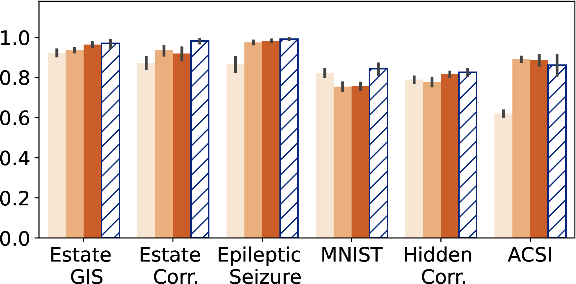
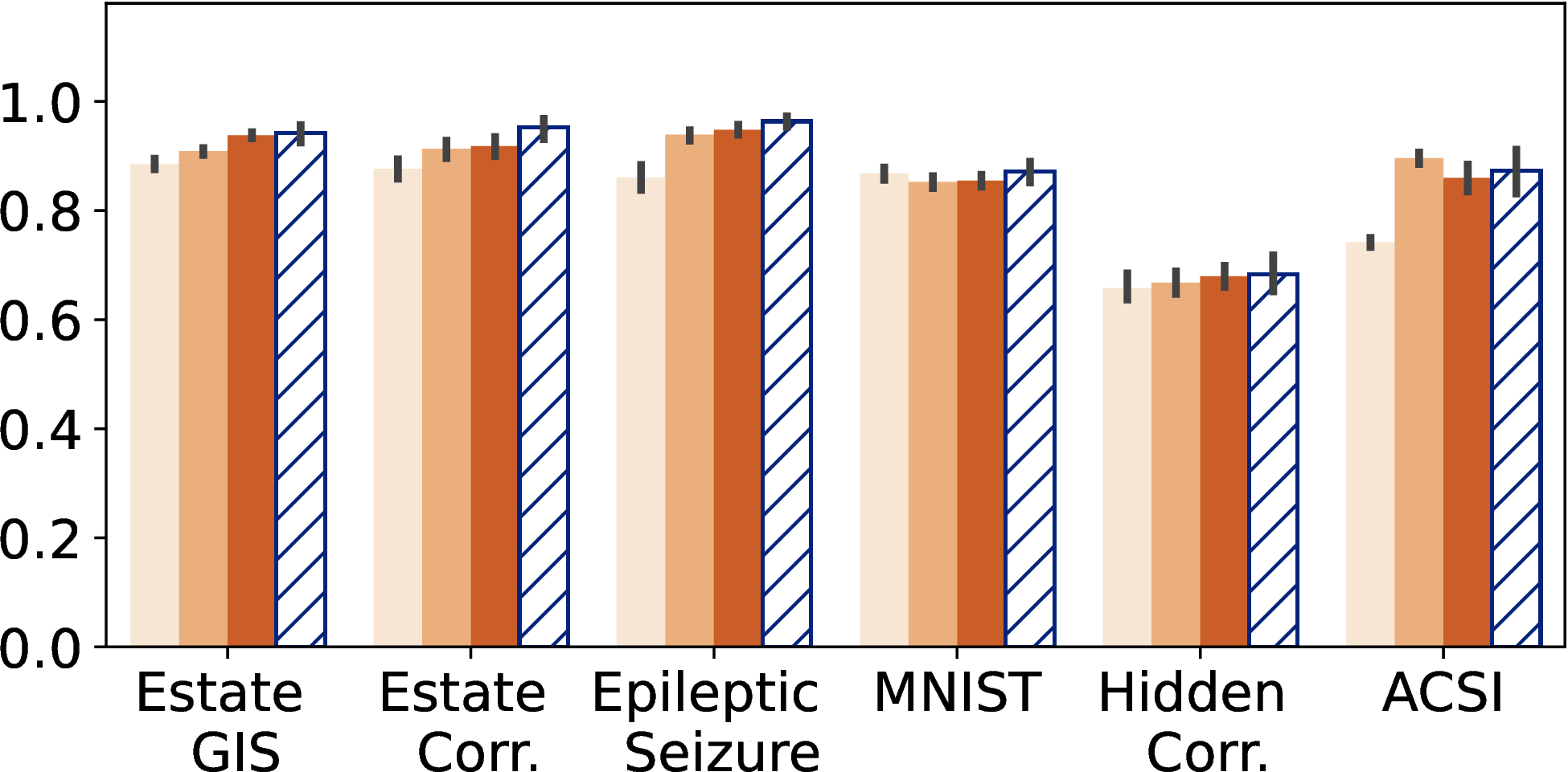
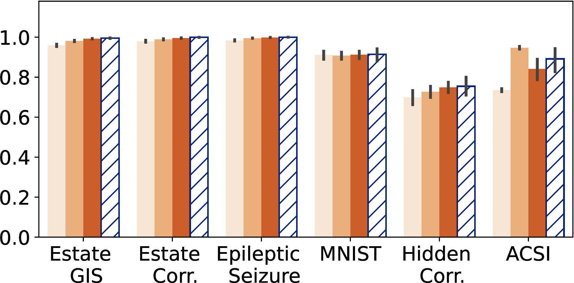
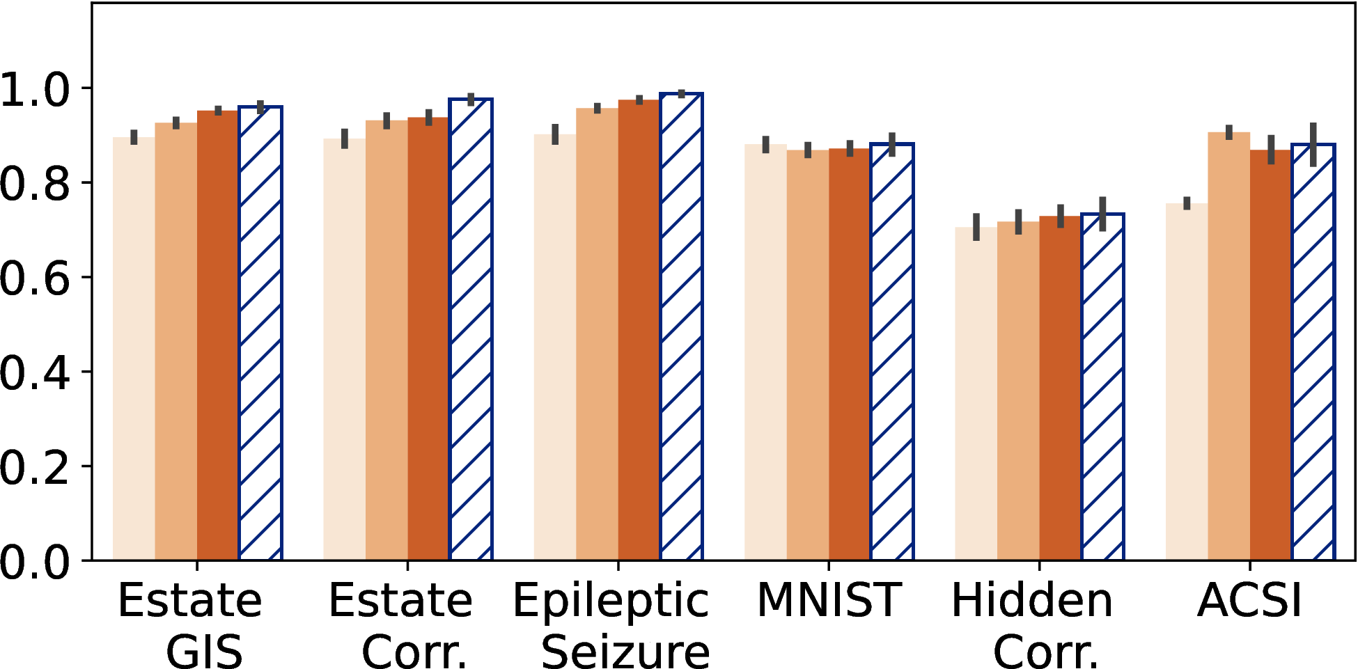
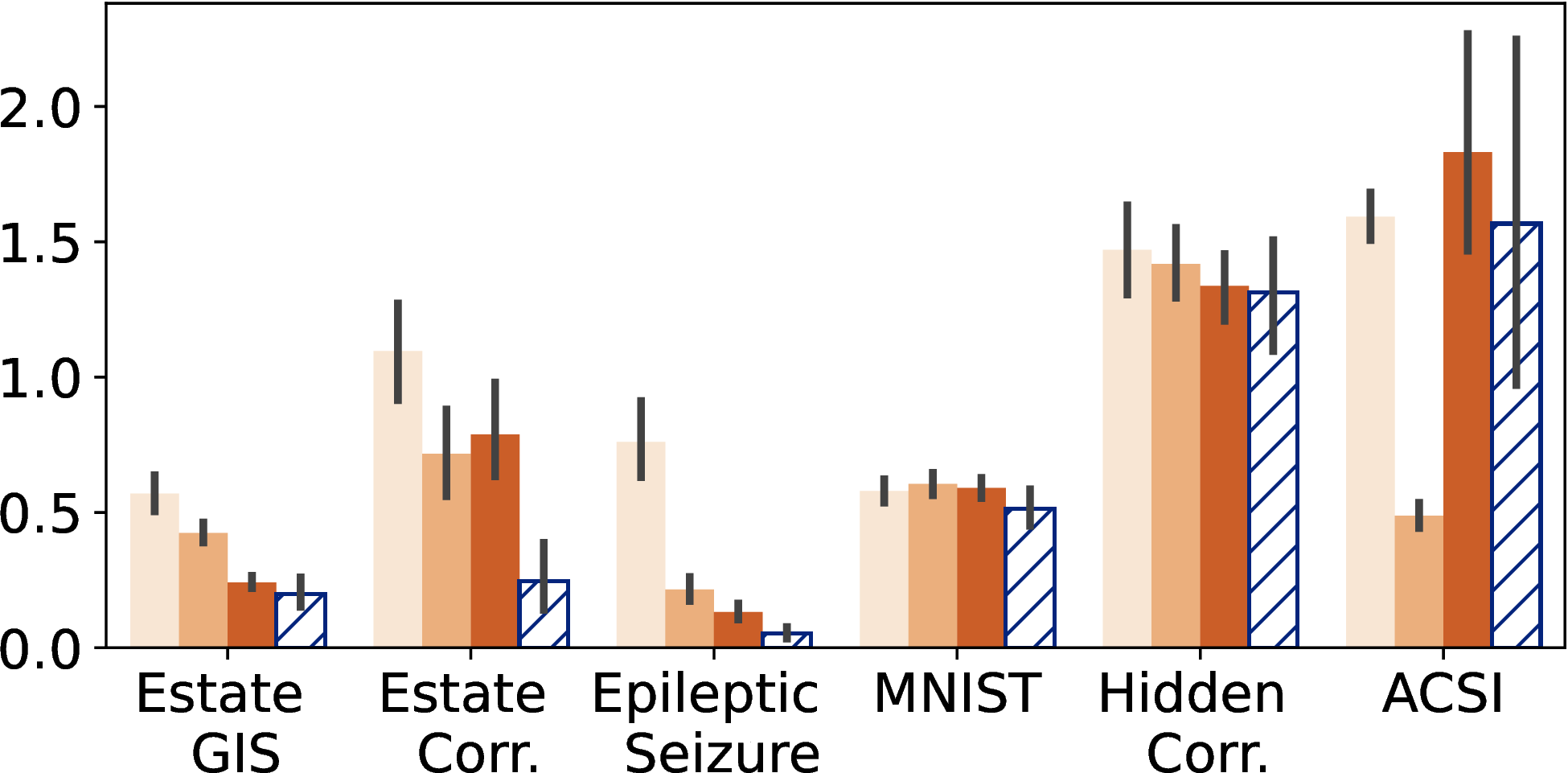
Figure 18: ApproPAwS shows similar performance to PAwS across all metrics and various levels of compression.. b — SSIM\(\uparrow\), c — 1-JSD\(\uparrow\), d — CC\(\uparrow\), e — SIM\(\uparrow\), f — EMD\(\downarrow\)
7 Related Work↩︎
Sampling for visualization is a common approach for interactive visual analytics both in the visualization and database communities.
Scatterplots are a primary focus for sampling algorithms in the visualization community. According to a proposed taxonomy, different approaches can be characterized based on their end goal as: preserving (1) relative densities, (2) spatial separation and data shape, and (3) outliers [2], [6]. Density-oriented sampling methods aim to preserve relative density differences across areas in a visualization. Prior efforts include designing a non-uniform sampling method that models density in the data and pixel space [26], [78], modeling density via singular value decomposition (SVD) [79], using Z-order space-filling curves (a binning approach for kernel density estimation) [56], [80], or designing customized KD-tree structures to balance the selection of data points in different visualization areas [30]. Max-Min [50], [54], visualization-aware sampling [16], and blue noise sampling [29] are methods that optimize for spatial separation and data shape. We discussed these approaches in detail in Sections 1 and 6. In the visualization literature, outliers are defined in multi-class scatterplots as the points whose class is different from the class of its neighbors [81]. A common strategy is to extend previously known methods to support this scenario [81]–[83]. Prior efforts though have not argued for directly modeling perception in sampling, which is a novel direction in our work, and our evaluation includes the state-of-the-art methods for single-class scatterplots that were found most effective in a recent user study [2].
Bars, pies, heat-maps, and lines charts are the focus of a lot of work in the database community [23]. Techniques primarily focus on sampling methods for approximate query processing (AQP) and incremental sampling [24], [25], [31], [84]–[92]. Typically the goal is to estimate an aggregate value with a desired confidence level. Thus, a common focus of these methods is estimating the number of samples needed to bound the estimation error. Alabi and Wu [31], the work closest to ours, use perceptual functions to estimate when the error becomes perceptually indiscernible for humans to improve sampling rates for approximate aggregation queries. Their work focuses on AQP and does not directly apply to scatterplots. We refer the reader to a survey for an in-depth review of related work for interactive and efficient data visualizations [23].
Information theory and probabilistic methods. Entropy and mutual information (MI) [11], [93], [94] have also been studied in the context of visualizations. The goal is to select a sample of points that preserve statistical associations among attributes of the original data. However, entropy and MI are both data-driven objectives targeting simulation and spatiotemporal data [93], [94]. There are also a few probabilistic sampling techniques used in the literature that use some level of randomization: stratified sampling, which divides the data set into non-overlapping groups based on some user-defined attribute and samples each group independently at random [27]; systematic sampling, which samples data points at a regular interval [28]; and clustering sampling, which, given a group of pre-defined clusters, randomly selects the clusters to be represented in a sample [95]. A major advantage of probabilistic sampling methods is they are easy to implement and computationally efficient. However, prior work has examined their limitations and highlighted the need for more sophisticated solutions [16].
Orthogonal approaches to sampling for improving the efficiency and usability of data visualization systems include data pre-fetching and pre-computation [96], designing specialized index structures for interactive visualizations [97]–[99], improving user experience and optimizing visualization design [1], [6], [13], [100]–[102], alternative data representations [103], and designing recommendation-based systems for data exploration and visualization [104]–[108].
Saliency maps and perception have seen interest in computer vision [38], [39] and natural language processing [40], [41]. However, data visualization does not always follow the rules of perception in the natural world [109], thus, improving on these models and adapting them to predict human focus in visualizations is an active problem in visualization research [32], [35], [110]. Saliency models for visualizations are still in their infancy but already demonstrate good performance at predicting attention-focus areas [32], [35]. We use the DVS model [32], which builds upon Itti et al. [111], as a black box. Future advances in visual perception tools can directly improve our methods through more effective saliency data.
8 Summary and Future Directions↩︎
In this paper, we introduce the problem of perception-aware sampling for scatterplot visualizations. We propose perception-augmented databases, which model perception as meta-data, and we design novel sampling methodologies to derive perception-aware samples (PAwS) and approximate visualizations (ApproPAwS). Our evaluation demonstrated significant quality and runtime gains, and a user study confirmed that humans prefer PAwS samples.
Many interesting questions remain on targeting samples toward particular visual analysis tasks and optimizing samples to multiple target visualizations. On-the-fly sample augmentation can be useful to support interactivity in visualizations (e.g., zooming in), and the biggest challenge is to achieve interactive sampling times. With eye-tracking technologies, one may also aim for on-the-fly sample adaptation, based on user interactions and eye-gaze. Importantly, evaluating sampling methods in the context of visualizations is challenging, as there is no established benchmark. Creating such a benchmark would facilitate future research and make the comparison among different techniques easier and more robust.
This work was supported by Adobe seed funding, a Google DANI award, and by the NSF under grants IIS-2237585, IIS-2311575, and IIS-2453461.
9 Appendix↩︎
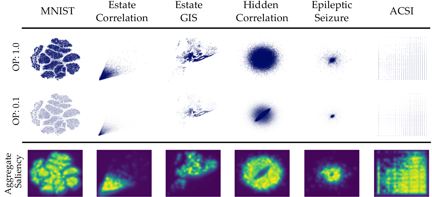
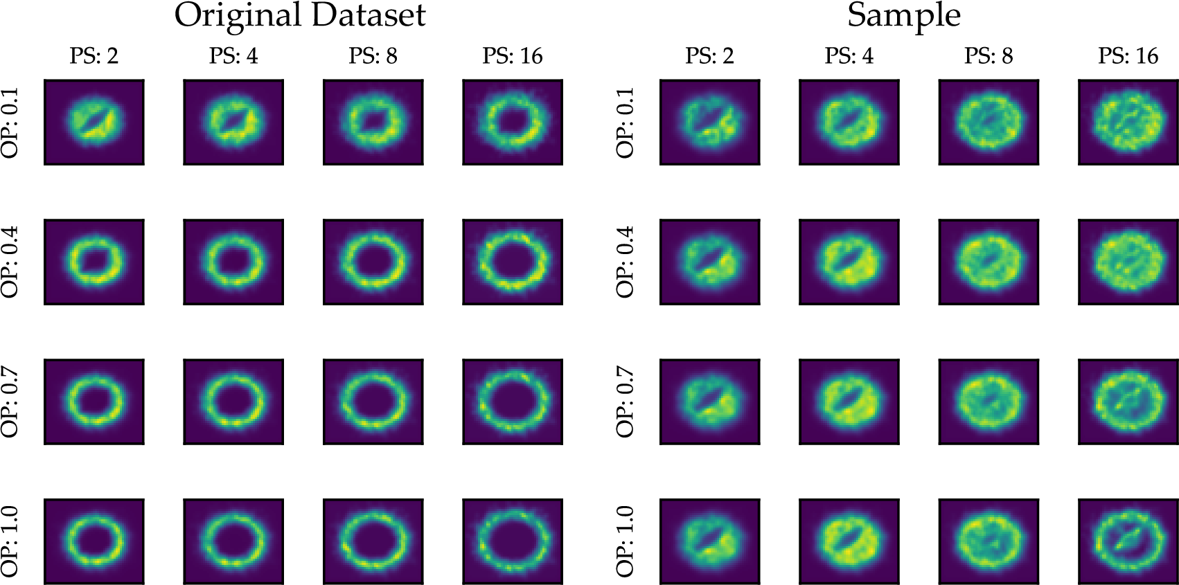
Figure 20: (a) Visualizations of the datasets we use in the experimental evaluation and their aggregate saliency maps. (b) We demonstrate the evaluation methodology on the hidden correlation dataset. We render the original dataset using 16 configurations by varying the opacity (OP) and point size (PS) and generate the saliency maps using DVS [32] (left). Given a sample, we use the same configurations to generate 16 saliency maps for the sample (right). We compare the saliency similarity of each pair (original and sample) with the same configuration, and compute the final perceptual similarity as the average across all 16 configurations.. a — Dataset visualizations and saliency stored in the perception-augmented DB, b — Perceptual similarity is averaged across all settings
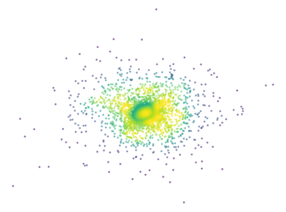
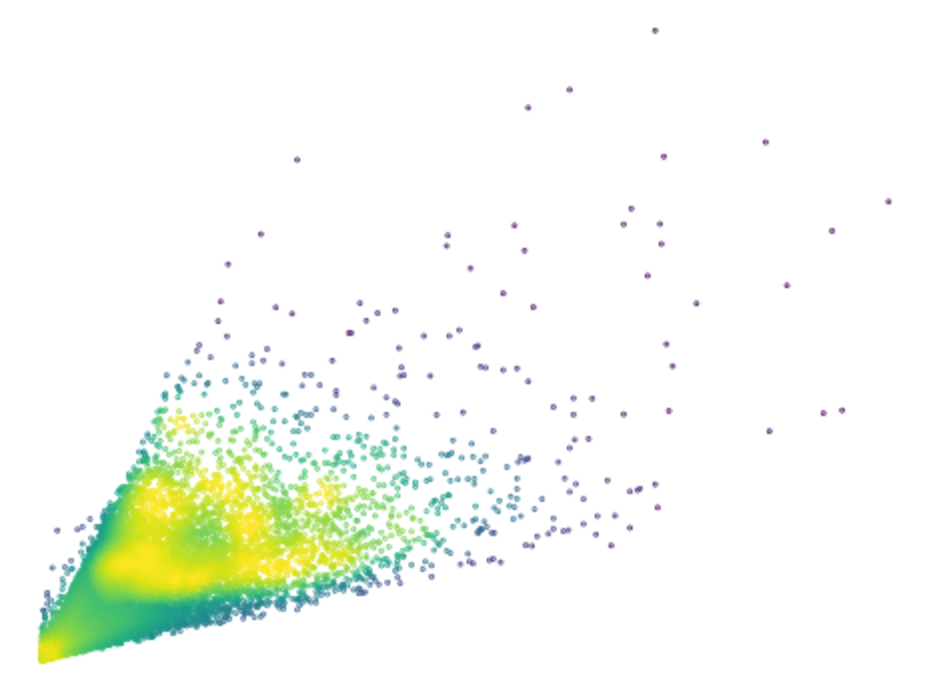
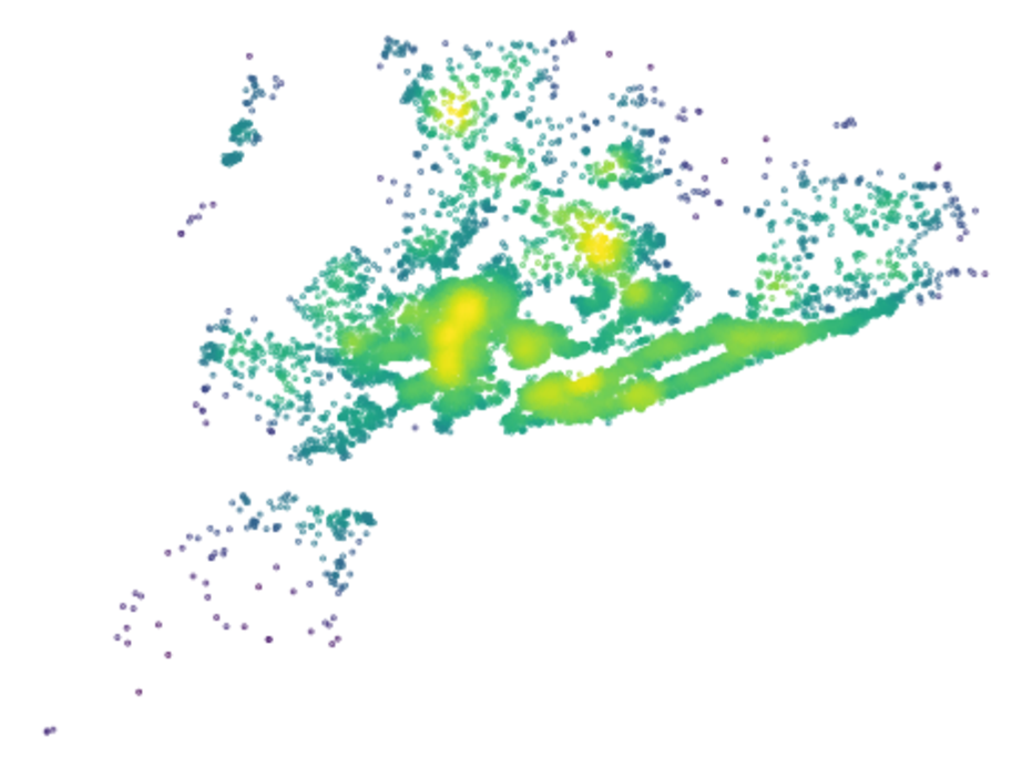
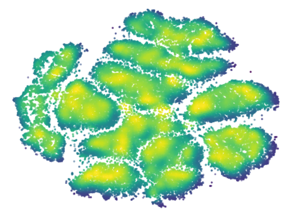
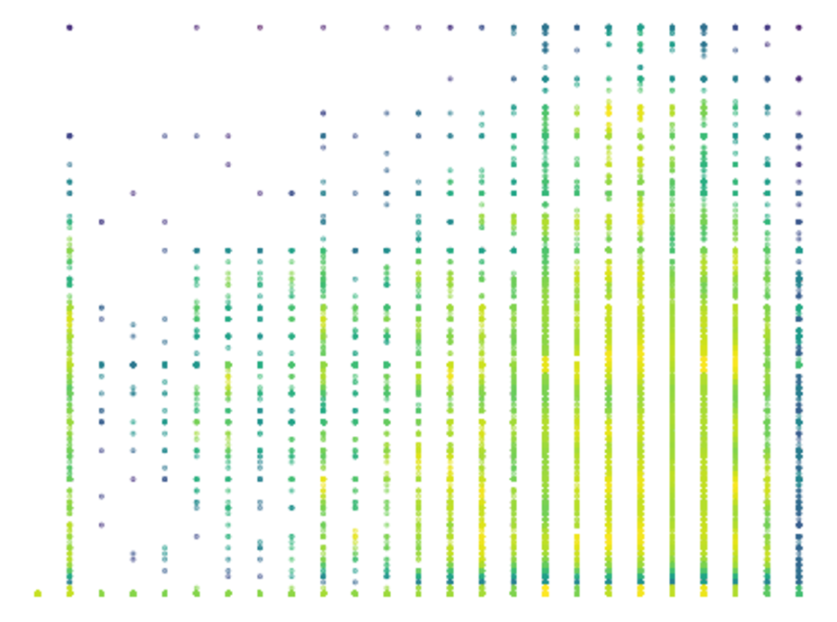
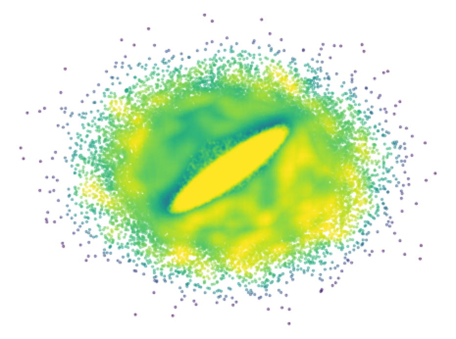
Figure 21: Perception weights for the datasets in our experimental evaluation.. a — Epileptic Seizure, b — Estate Correlation, c — Estate GIS, d — MNIST, e — ACSI, f — Hidden Correlation
Overview of experimental design. Figure 20 provides an overview of the experimental design choices we described in Section 6. We show the aggregate saliency maps derived using our approach and describe our methodology for computing perceptual similarity. Figure 21 shows the perception weights for the datasets in our evaluation, assigning a higher perception value to highly salient or highly dense areas.
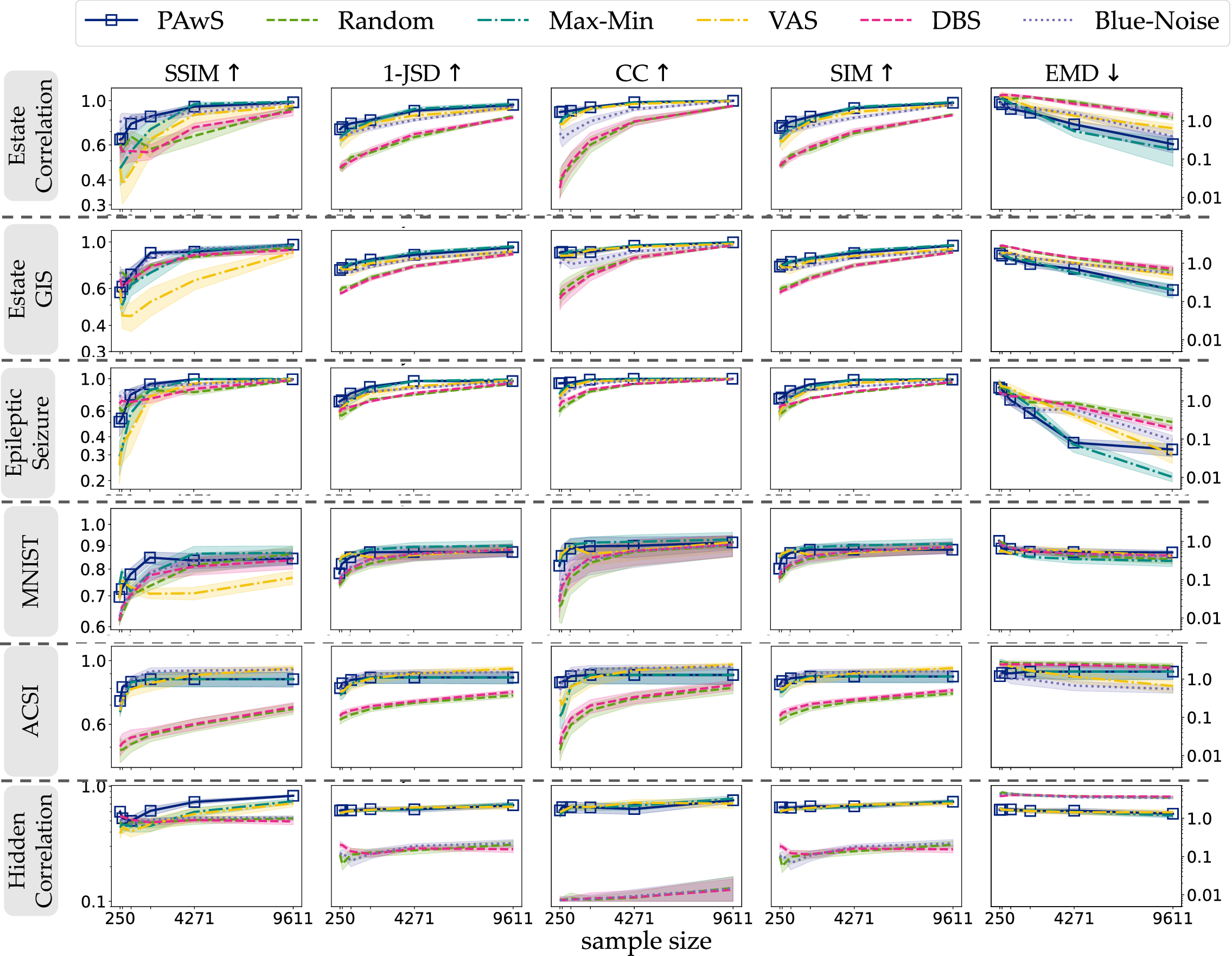
Perceptual similarity metrics. Figure 22 shows extensive results about the behavior of different sampling methods across six datasets and five evaluation metrics introduced in Section 5. The observations we make are consistent with the discussion in Section 6, and different metrics show similar results. PAwS has strong behavior across all datasets and metrics, while probabilistic-based approaches consistently underperform. Max-Min and Vas typically perform better as the sample size increases. The behavior of Blue-noise varies across datasets, while in hidden correlation performs as poorly as probabilistic-based methods with extremely low scores in SIM, CC, and 1-JSD metrics. We note EMD is a difficult metric to optimize for, and in some datasets (i.e., in epileptic seizure) all sampling methods reach lower scores.
Qualitative samples and user study results per dataset. Figure 23 shows the visualizations we used in our user study across four criteria. The study included 6 datasets, and for each dataset, participants compared a PAwS sample to an alternative baseline sample at a time (five in total). The sample sizes were chosen according to the original dataset sizes: \(1,898\) (\(\sim\) 16%) for Epileptic Seizure, \(1,898\) (\(\sim 11\)%) for Estate Correlation and Estate GIS; \(4,571\) (\(\sim 6\)%) for MNIST; and 9,611 (\(\sim 4\)% and \(\sim 0.3\)%) for the larger ACSI and Hidden Correlation datasets. In total there were: \(6 \;\mathrm{datasets} \;\times \;5 \;\mathrm{sample pairs} \;\times \;4 \;\mathrm{tasks}\), resulting in 120 tasks. To distribute the workload, each participant completed tasks for 3 of the 6 datasets, and the datasets were evenly presented to participants.
Figure 24 reports how often participants preferred PAwS over an alternative baseline concerning their efficacy in maintaining correlation trends, clusters, and other patterns; Figure 25 reports how often participants preferred PAwS over an alternative baseline concerning their efficacy in retaining outliers and overall data shape; and Figure 26 report users’ preference concerning density variations. Finally, Figure 27 shows the result for the best overall sample per dataset. We observe PAwS is frequently preferred by humans compared to state-of-the-arts methods, while the preference becomes more evident in datasets where other sampling methods fail to represent some trend in the data; for instance, in hidden correlation, PAwS is overly favored compared to all other methods, which fail to represent both the correlation trend and the overall data distribution. Similarly, in ACSI, humans overly prefer PAwS compared to probabilistic-based approaches that create an evident underrepresented region in the sample.





Figure 23: Visual stimuli used in the user study experiments for all datasets and sampling methods.. a — Epileptic Seizure, b — Estate Corr, c — Estate Anomalies, d — MNIST, e — ACSI, f — Hidden Correlation

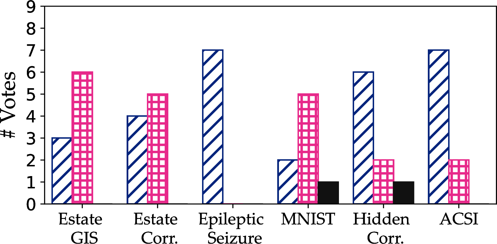
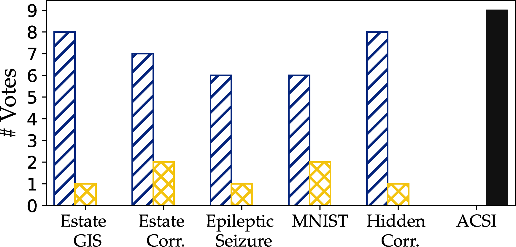
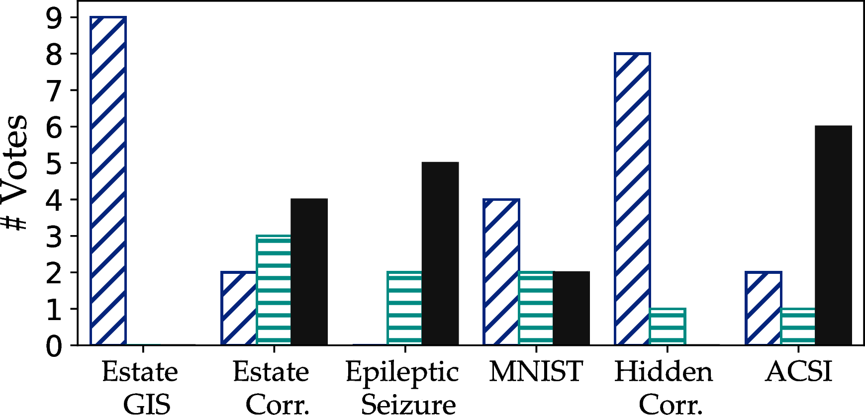
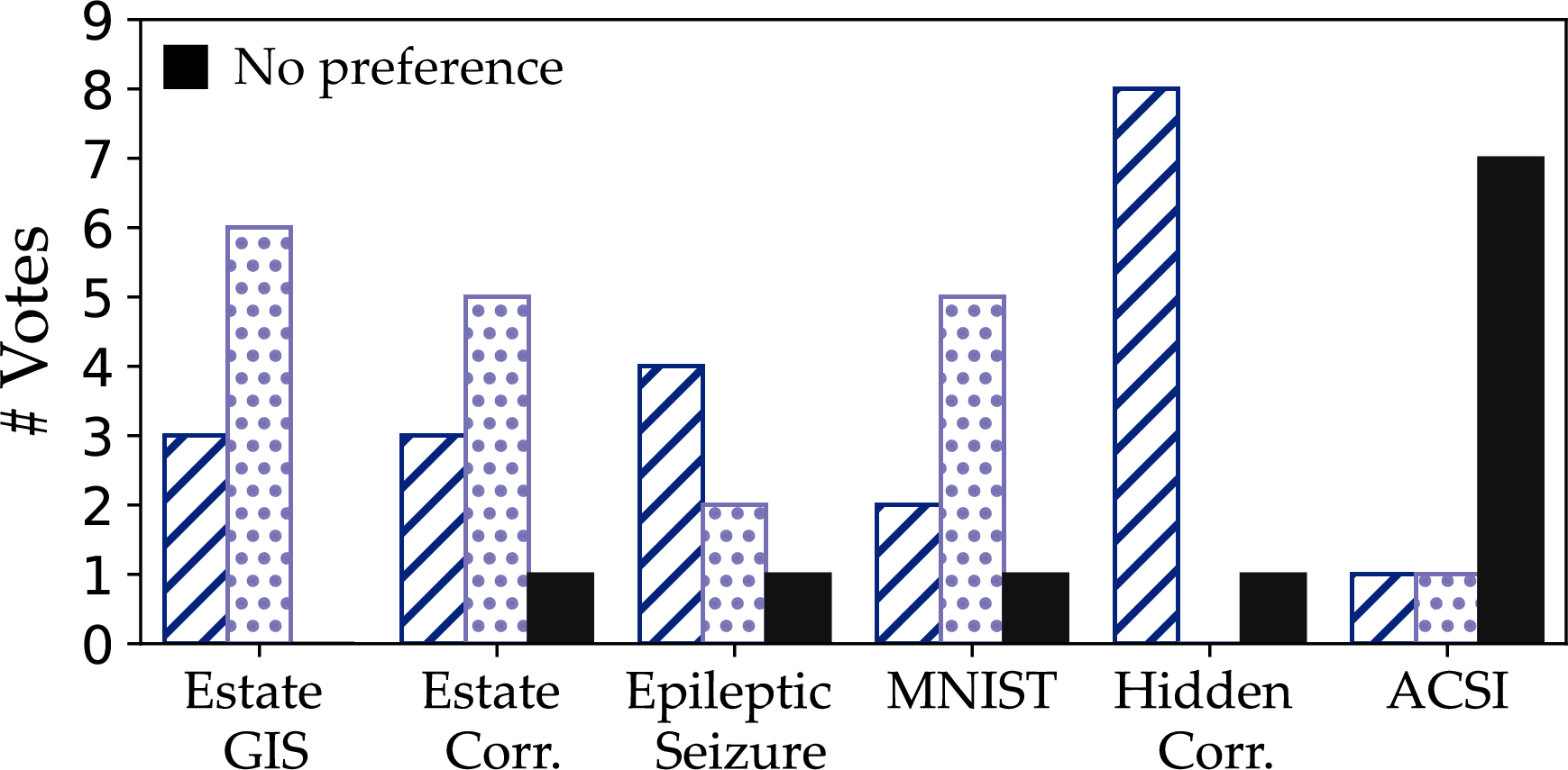
Figure 24: A per-dataset analysis of users’ preferences for the sample that better represents correlation trends, clusters, and other patterns.. a — PAwS vs Random, b — PAwS vs DBS, c — PAwS vs Vas, d — PAwS vs Max-Min, e — PAwS vs Blue-noise

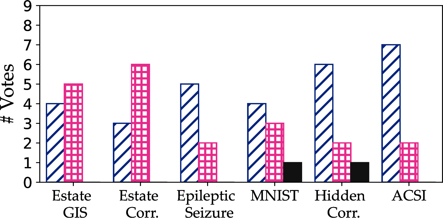
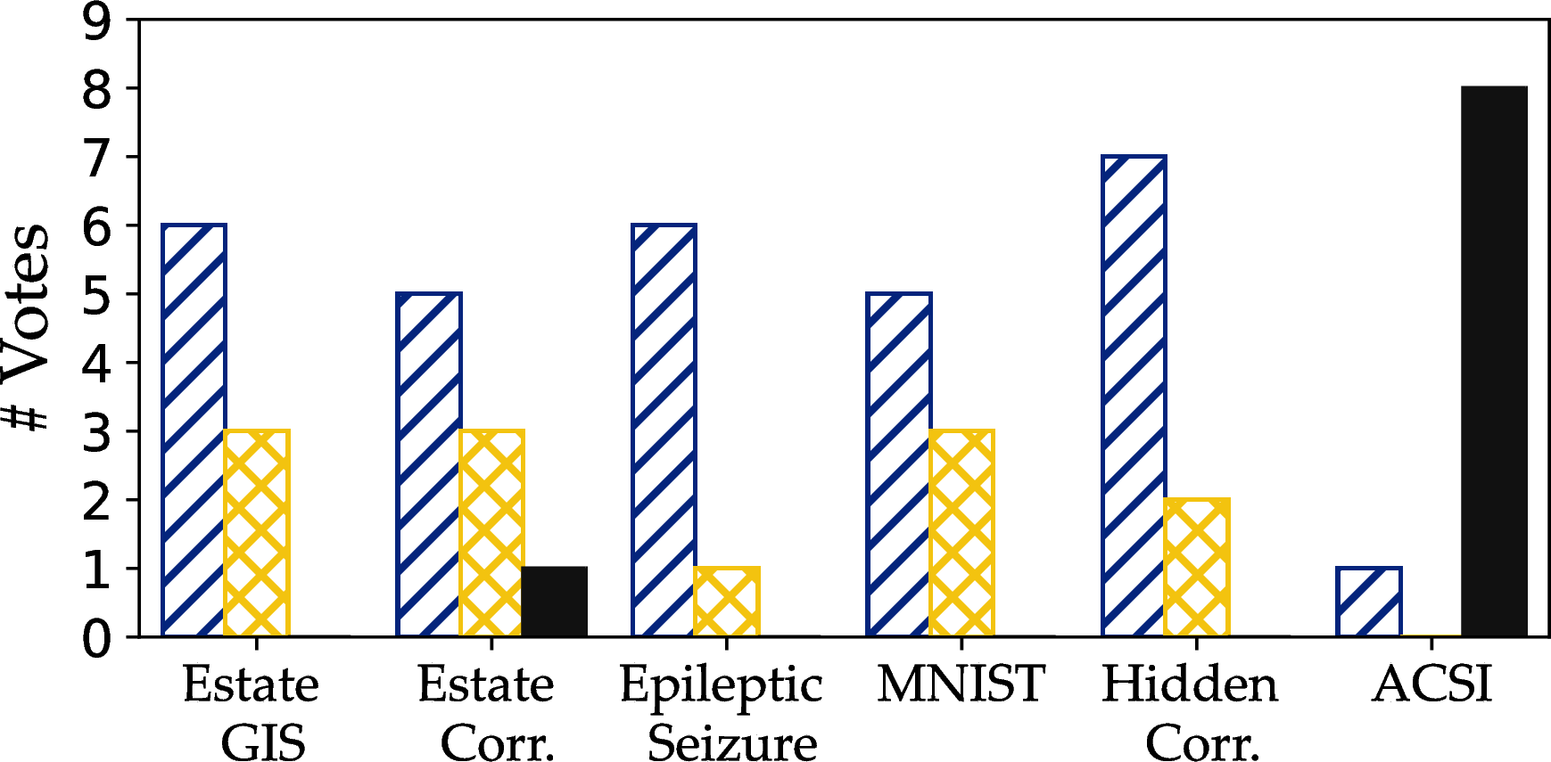
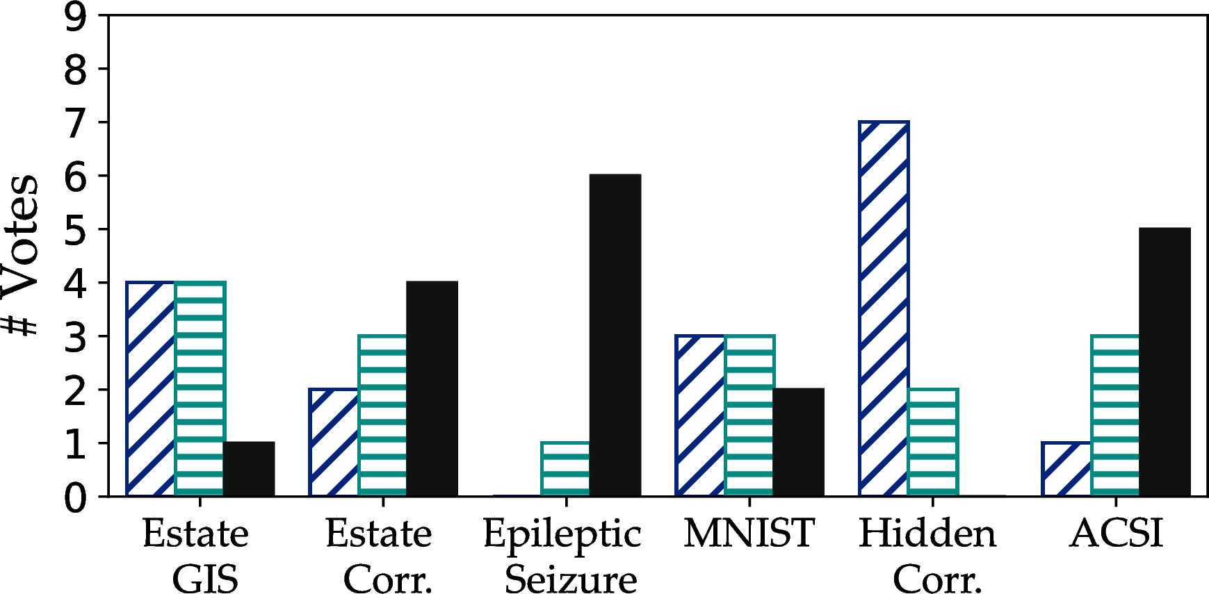
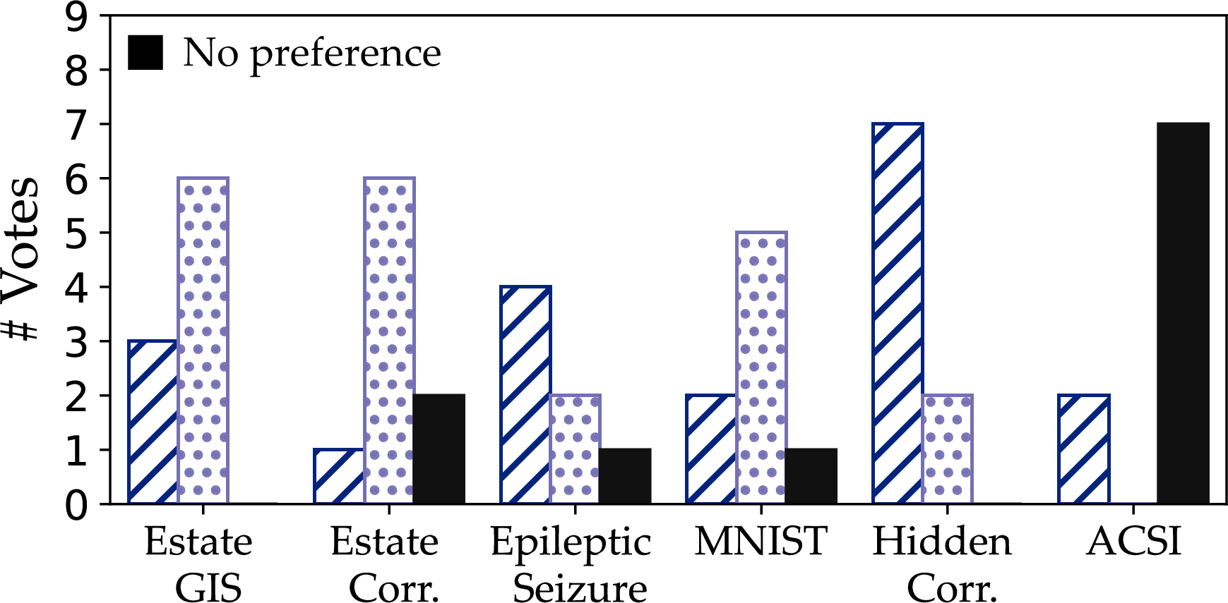
Figure 25: A per-dataset analysis of users’ preferences for the sample that better represents outliers and overall data shape.. a — PAwS vs Random, b — PAwS vs DBS, c — PAwS vs Vas, d — PAwS vs Max-Min, e — PAwS vs Blue-noise


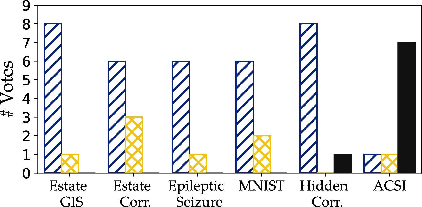
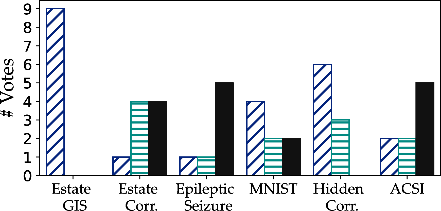

Figure 26: A per-dataset analysis of users’ preferences for the sample that better represents density variations.. a — PAwS vs Random, b — PAwS vs DBS, c — PAwS vs Vas, d — PAwS vs Max-Min, e — PAwS vs Blue-noise

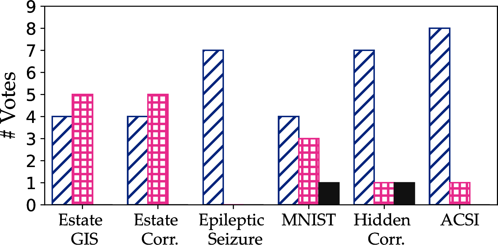
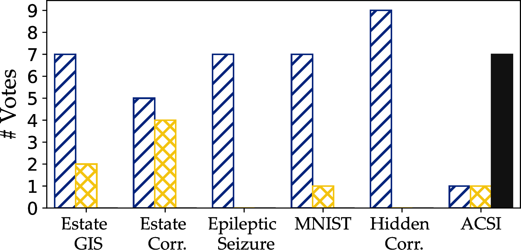
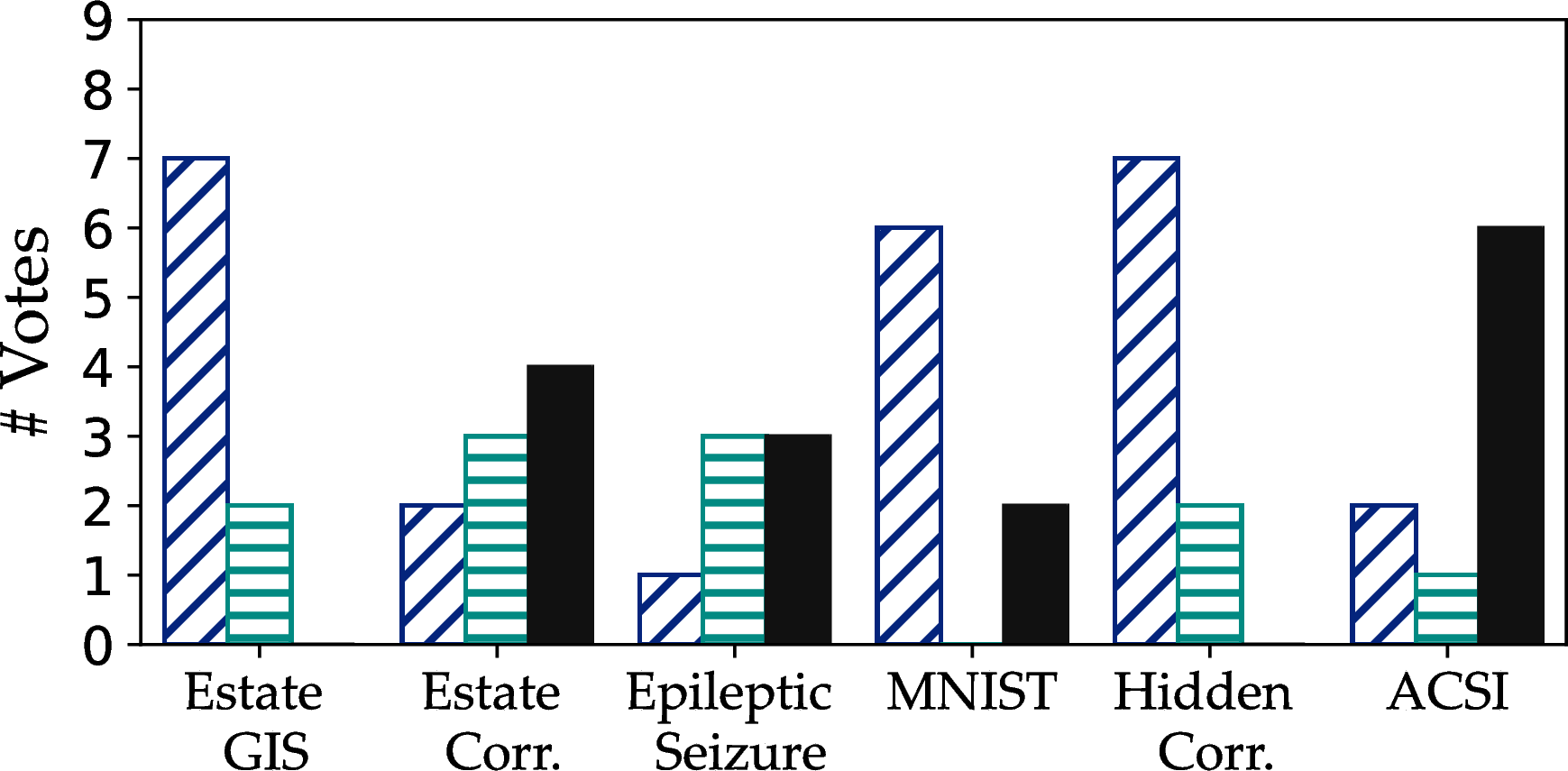
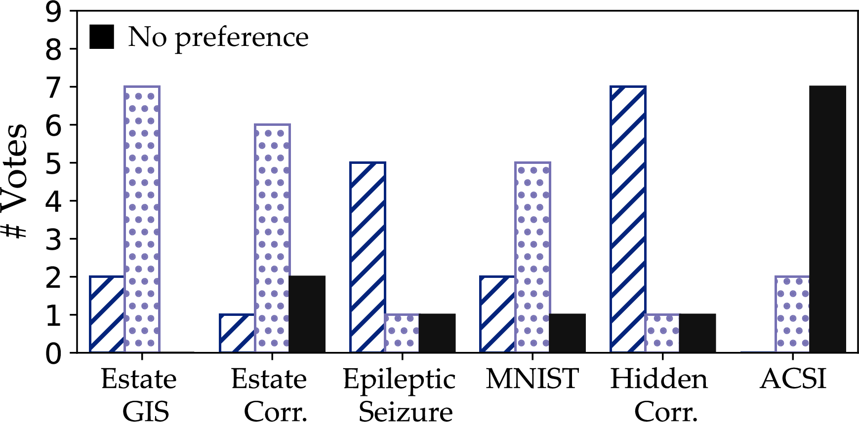
Figure 27: A per-dataset analysis of users’ preferences for the best overall sample.. a — PAwS vs Random, b — PAwS vs DBS, c — PAwS vs Vas, d — PAwS vs Max-Min, e — PAwS vs Blue-noise
Compression schemes and ApproPAwS samples. We report additional results for ApproPAwS(Algorithm 2), which is our method for approximate visualizations. ApproPAwS uses perception-aware compressed data representations to derive samples without having access to the original data. Our compression approach (Section 4) uses two thresholds, \(\lambda\) and \(\sigma\), to derive these data representations and splits the canvas into non-overlapping bounding boxes that sufficiently approximate the data in them (as guided by \(\lambda\)), and cover areas of similar perception weights (as guided by \(\sigma\)). Then ApproPAwS creates a sample by selecting points uniformly at random from these boxes. Lower values for the thresholds result in representations with a higher number of boxes that closely represent the underlying data (lower compression), and thus, the level of distortion observed in an ApproPAwS sample is lower.
We present results at three compression levels: (1) low: \(\langle \lambda, \sigma \rangle= \langle 0.001, 0.001 \rangle\), (2) medium: \(\langle \lambda, \sigma \rangle= \langle 0.002, 0.001 \rangle\), and (3) high: \(\langle \lambda, \sigma \rangle= \langle 0.003, 0.01 \rangle\). For consistency and ease of exposition, we use the same threshold values for all datasets but ACSI. For ACSI, to observe notable differences across compression schemes, we vary the thresholds as: (1) low: \(\langle \lambda, \sigma \rangle= \langle 0.001, 0.001 \rangle\), (2) medium: \(\langle \lambda, \sigma \rangle= \langle 0.005, 0.001 \rangle\), and (3) high: \(\langle \lambda, \sigma \rangle= \langle 0.01, 0.01 \rangle\). Figure 28 shows the derived compression schemes, and Figure 29 shows samples, across three sampling sizes, derived by ApproPAwS while using the corresponding data representations. We observe that qualitative degradation becomes more visible in high compression schemes, but ApproPAwS still captures the main trends and shape of the datasets.
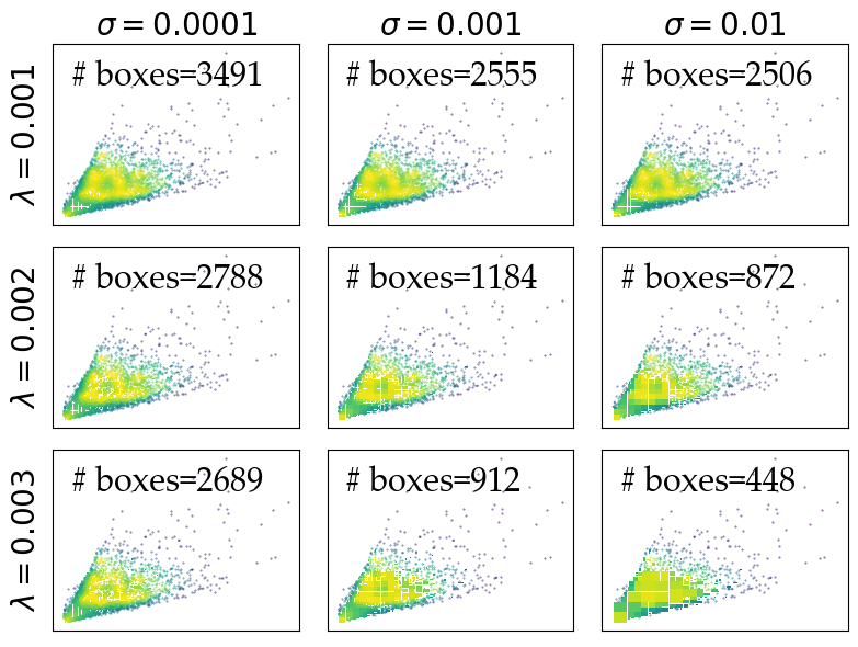
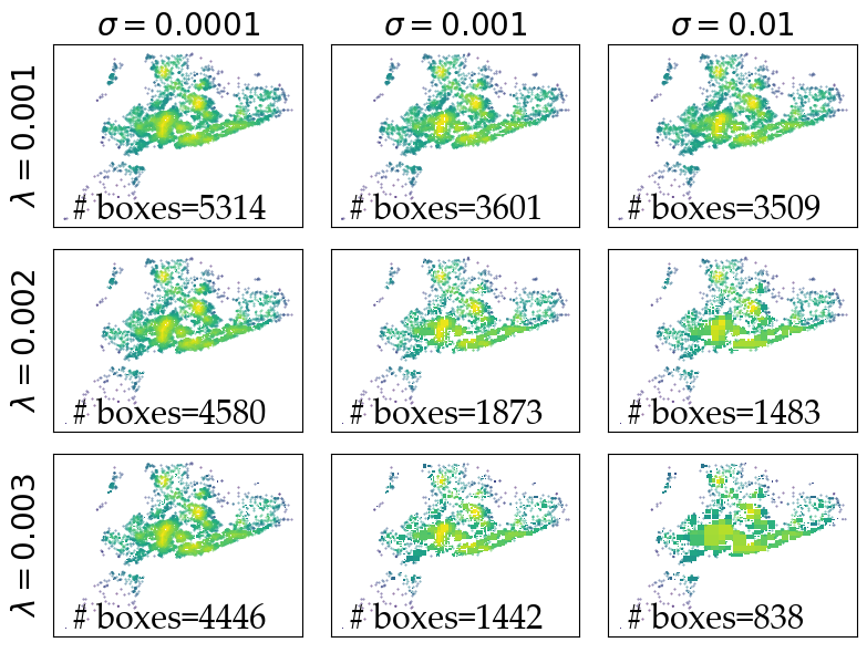
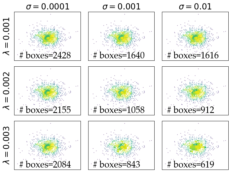
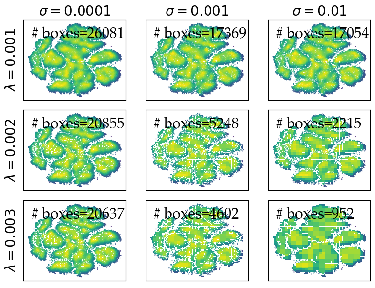
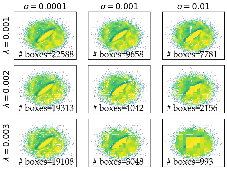

Figure 28: Perception-aware compression schemes for the datasets in our evaluation. We show how the parameters of the perception-aware compression approach affect the number of boxes of the scheme, and ultimately compression.. a — Estate Correlation, b — Estate GIS, c — Epileptic Seizure, d — MNIST, e — Hidden Correlation, f — ACSI
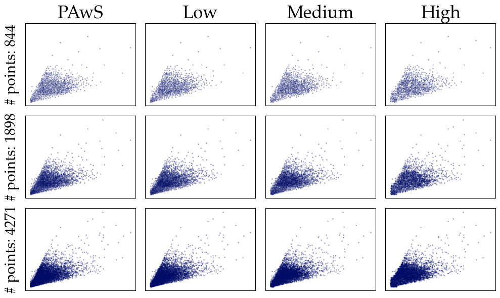
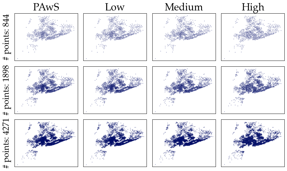
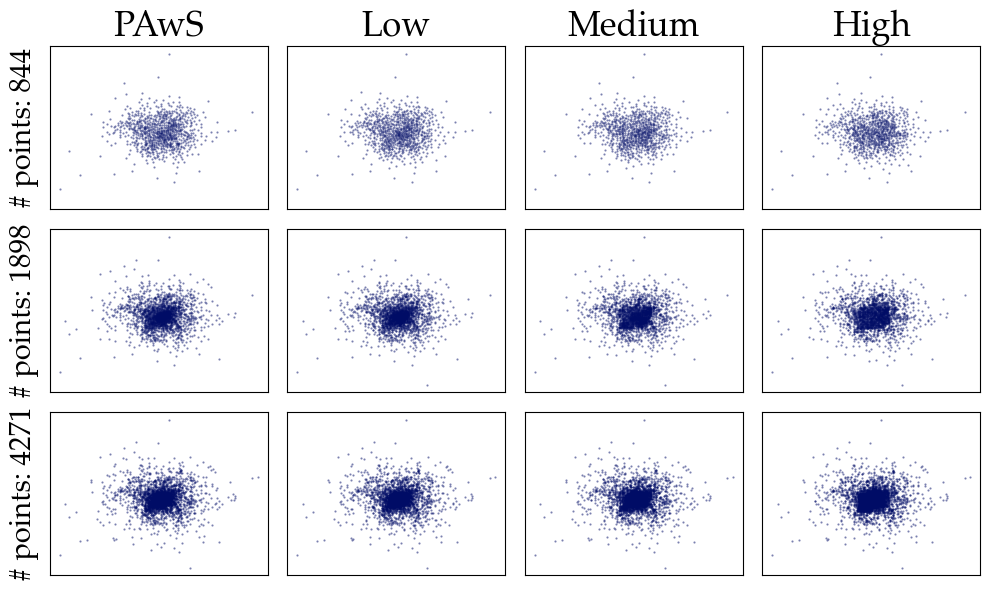
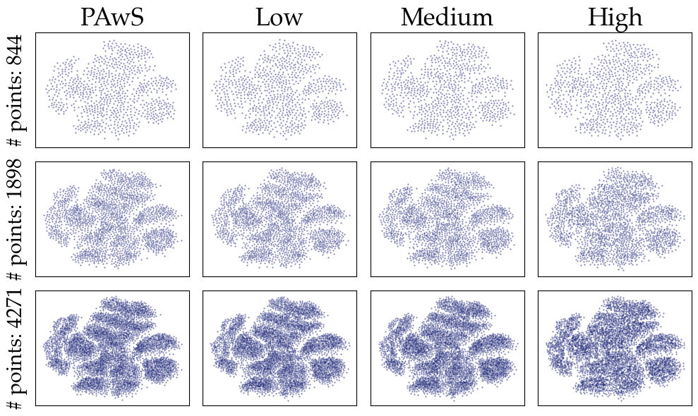
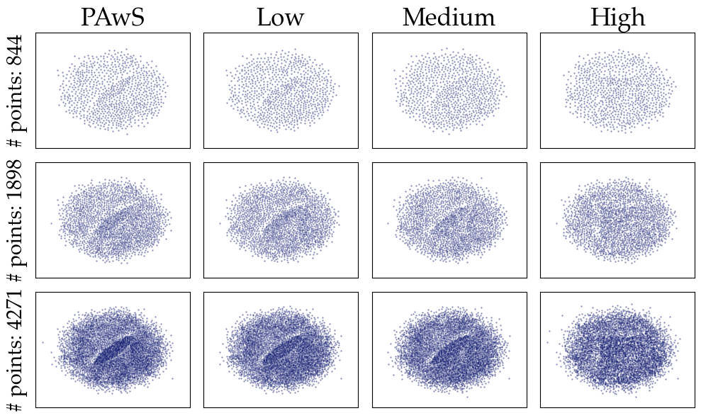
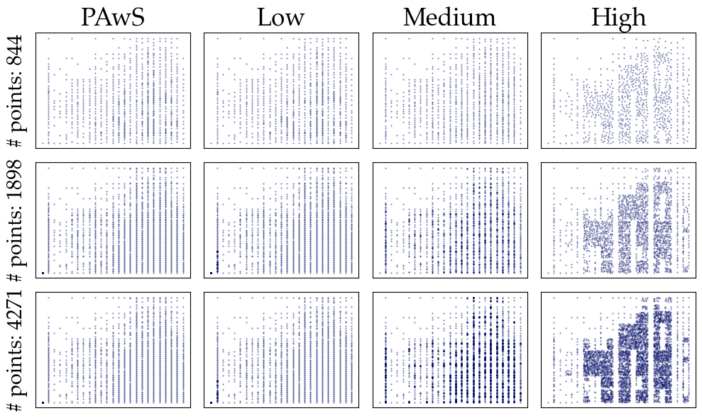
Figure 29: Approximate visualizations of various sample sizes, as derived by ApproPAwS using three perception-aware compressed data representations. We show results for three levels of compression for the various datasets.. a — Estate Correlation, b — Estate GIS, c — Epileptic Seizure, d — MNIST, e — Hidden Correlation, f — ACSI
References↩︎
Small values of \(r\) (prioritizing dense areas) improve runtimes, but worsen coverage; e.g., for \(r=0\) blue-noise acts like random.↩︎
https://github.com/wmayner/pyemd↩︎
https://github.com/thu-vis/libsampling/blob/master/data/mnist.npz↩︎
https://www.kaggle.com/datasets/ivanchvez/ny-rental-properties-pricing↩︎
https://www.kaggle.com/datasets/harunshimanto/epileptic-seizure-recognition↩︎
Since the data lies in a unit square after normalization, we set \(\epsilon = \sqrt{2}/100\) because \(\sqrt{2}\) is an upper bound on the diameter value of \(\mathcal{D}\).↩︎
https://github.com/thu-vis/libsampling/blob/master/sampling/SamplingMethods.py↩︎
Our implementation employs a non-parametric, state-of-the-art, tree-based, density estimator from the scikit-learn library [75], [76]. Off-the-shelf density estimators were not scalable for hidden correlation (\(\sim 3.5\)M), and we approximated the behavior by rendering the original data using a small point (2px) & opacity (10%) configuration .↩︎